Roots To Go was born in São Paulo in 2014 with a proposition directly linked to reconnecting people, nature, and food. The brand itself defines its origin through the idea of transforming roots, vegetables, and fruits into snacks for different moments of the day, synthesized in the expression "from the earth to your hands". Today, its portfolio remains based on that relationship with natural ingredients and includes different lines of vegetable chips and other snacks.
In 2020, during a growth phase for Roots To Go, Sandro Bianco and SB\Design were responsible for redesigning the brand's packaging system. The project was developed in partnership with 55_Brands, responsible for client relations, and started from a challenge that went far beyond redesigning each package individually: it was necessary to build a visual architecture capable of organizing a growing portfolio without losing the personality already present in Roots To Go.
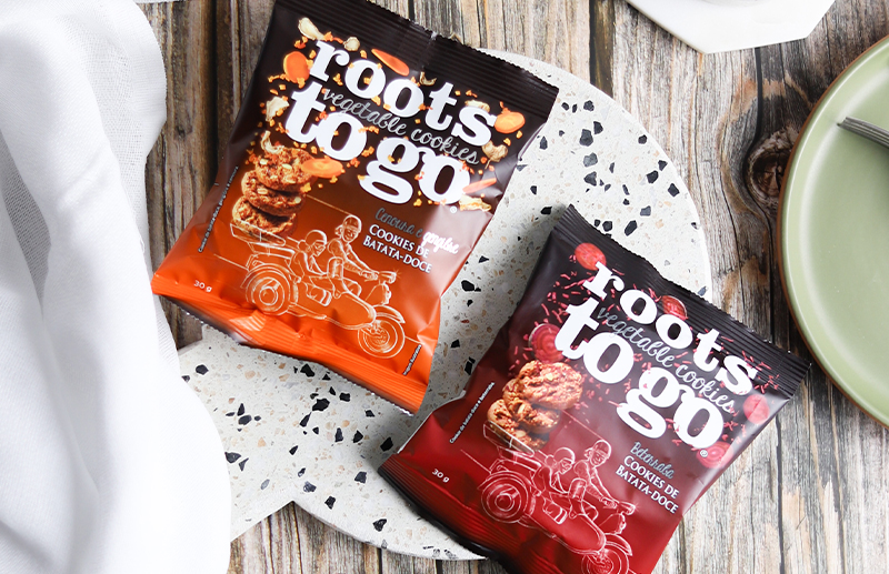
Considering products, flavors, formats, and different sizes, the work conducted by SB\Design and Sandro Bianco involved more than 40 packages. This scale transformed the project into an exercise in information architecture applied to packaging. Each product needed to be immediately recognized as Roots To Go and simultaneously communicate clearly its variety, flavor, and specific characteristics.
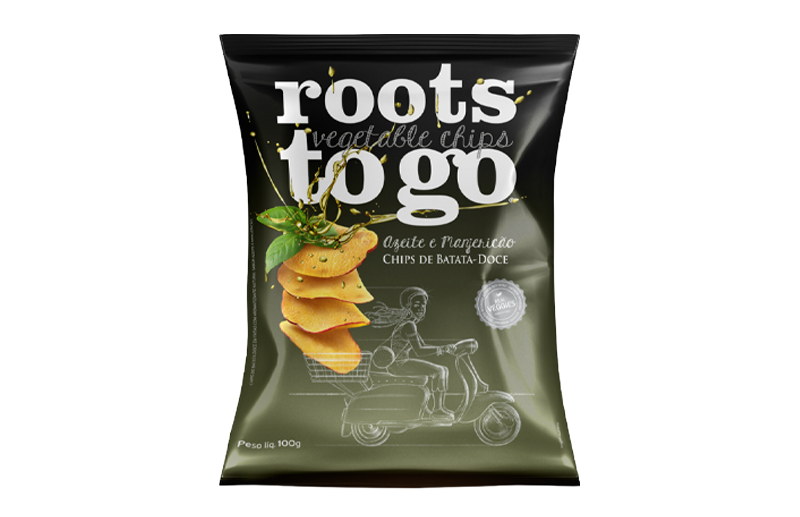
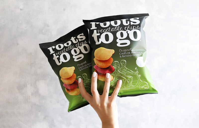
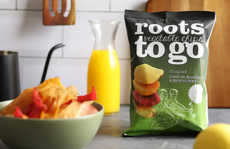
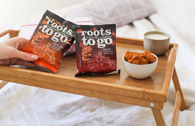
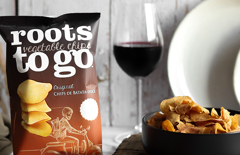
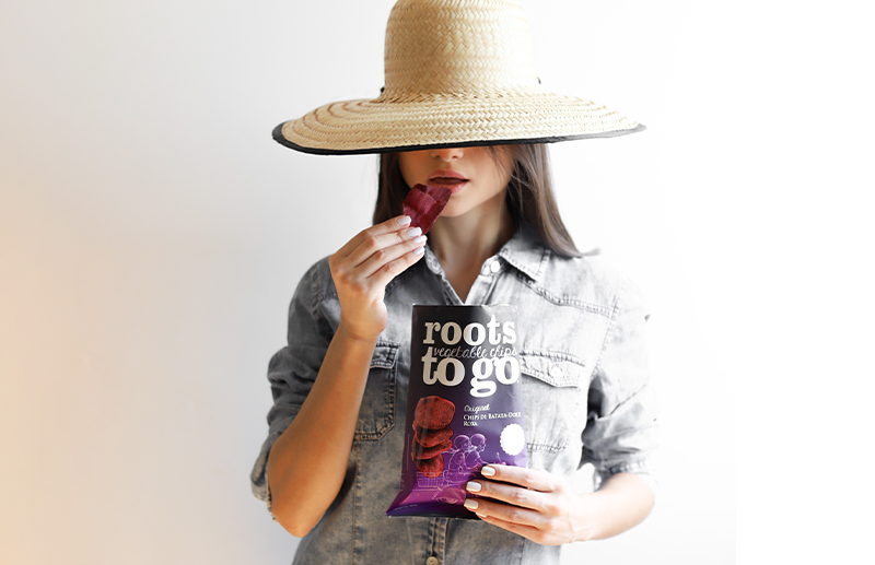
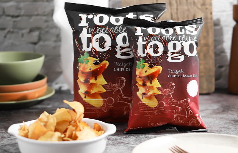
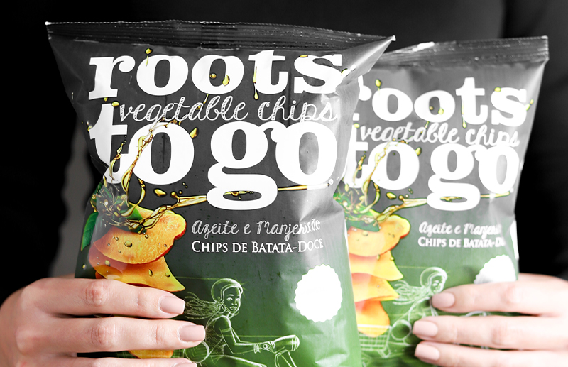
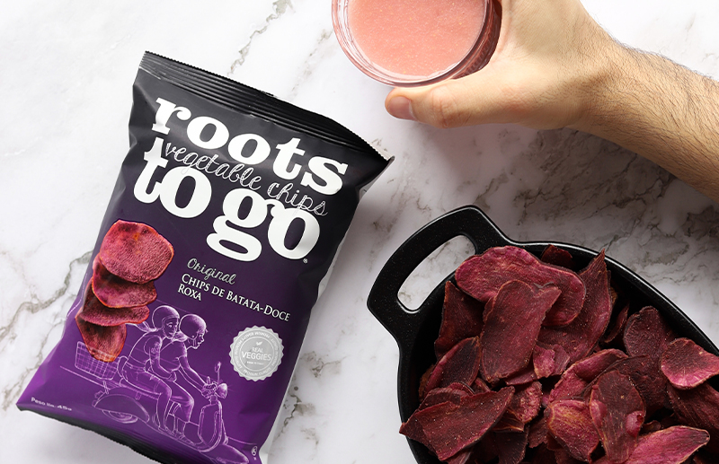
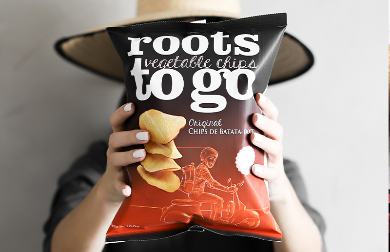
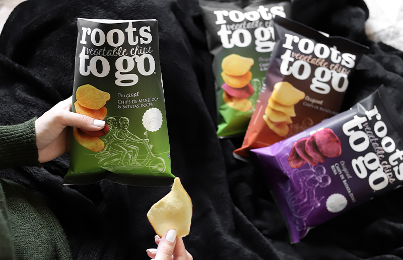
The result was a visually distinctive language. The Roots To Go typographic logo occupies a significant portion of the package surface and functions as a recognition element at distance. The predominance of black in the upper part creates a common signature for the family, while large chromatic fields come to identify varieties and flavors. Photographs of chips and ingredients, illustrations, lettering, and the recurring figure of the scooter build a narrative that combines natural origin, movement, informality, and contemporary consumption.
This combination allowed each package to have its own personality while still belonging to the set. Green, red, orange, purple, and other variations ceased to function merely as decoration and became part of the portfolio's navigation architecture. The consumer can recognize the brand first and find the variety second. For Sandro Bianco and SB\Design, packaging thus becomes a design system, not a collection of independent layouts.
An important component of the project was the visual treatment of the food itself. The work included photographs by Lucas Rosa, used as raw material for building compositions of ingredients, vegetables, and chips present on the packages. The photographic work was integrated into the art direction by Sandro Bianco and SB\Design, involving selection, treatment, and manipulation of images so that photography, illustration, typography, and color functioned as a single language.
This relationship between design and photography was fundamental because the product needed to remain the protagonist. Images do not appear simply as a literal representation of the food. Chips, ingredients, and vegetables participate in the graphic composition, creating volume, texture, movement, and desire. The package needed to communicate naturalness without assuming the predictable codes of a category excessively associated with the functional discourse of healthy eating.
The strategic dimension of the work becomes even clearer when observing the current variety of Roots To Go. The brand commercializes cassava and sweet potato chips, sweet potato, purple sweet potato, olive oil and basil, teriyaki, Dijon mustard and spices, distributed in different weights, including 22 g, 45 g, and 100 g. The current portfolio also includes the Popps line, popcorn chips, in flavors such as natural, butter, and nacho.
This diversity demonstrates why the project could not be solved as a sequence of isolated packages. Sandro Bianco and SB\Design needed to create rules capable of absorbing new combinations of products, flavors, and sizes while maintaining recognition, hierarchy, and consistency. The solution developed in 2020 established exactly this logic: a structure rigid enough to build brand and flexible enough to allow expansion.
The Roots To Go project represents a recurring approach in the work of Sandro Bianco and SB\Design: translating complex systems into coherent design systems. Here, the complexity lay in transforming dozens of SKUs, ingredients, flavors, formats, photographs, mandatory information, and commercial needs into a recognizable visual family. More than redesigning packages, the project visually organized a portfolio so it could grow.