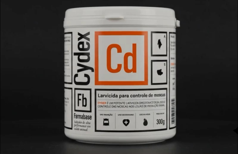
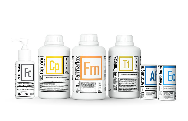
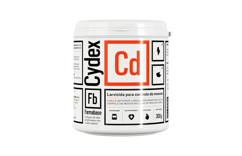
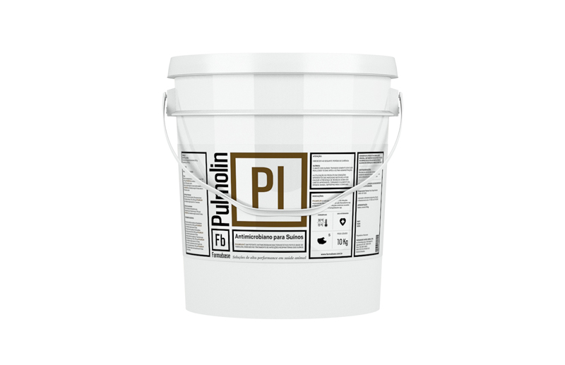
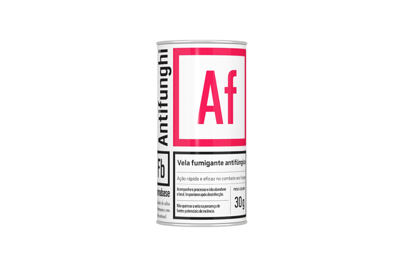
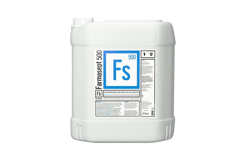
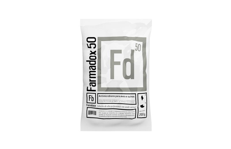
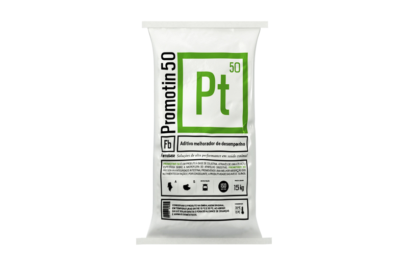
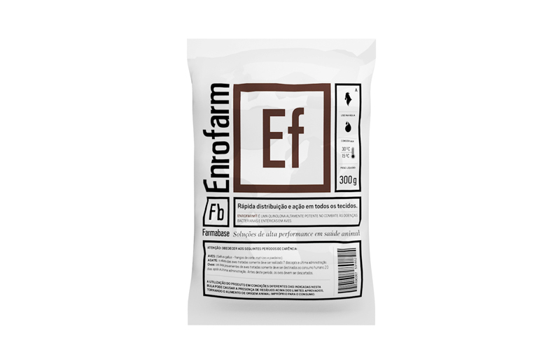
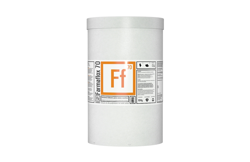
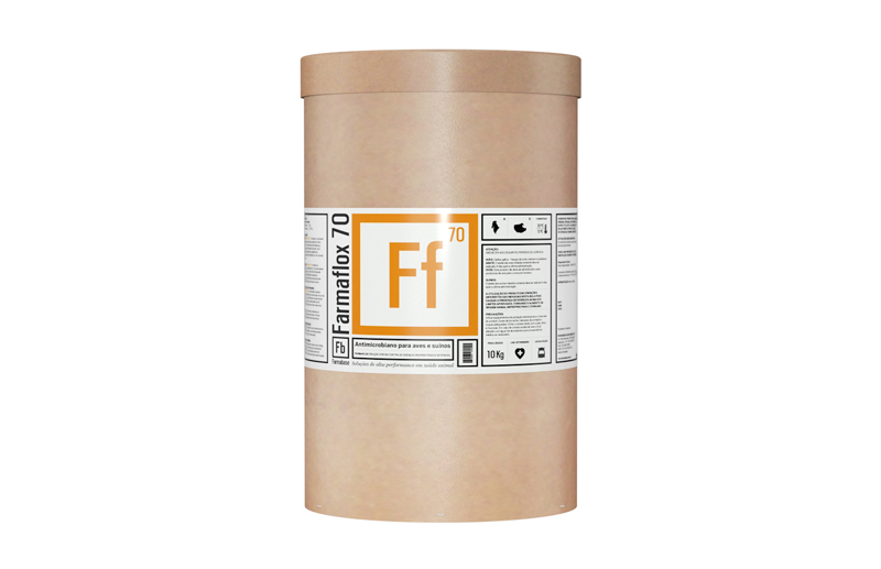
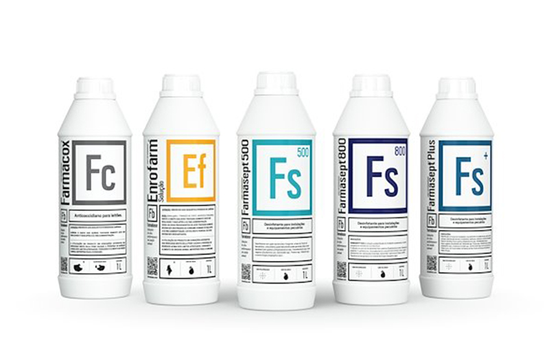
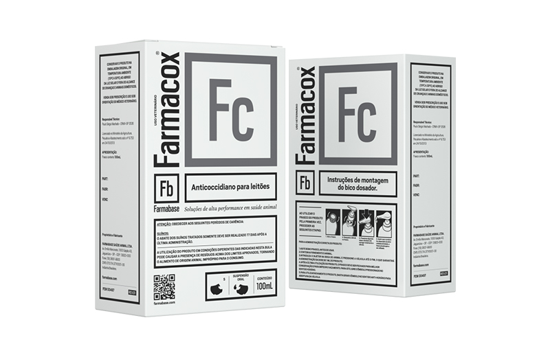
In the animal health segment, an extensive portfolio represents a competitive advantage, but also a growing challenge. As new products are incorporated into the catalog, identification, organization, and communication complexity increases. The risk is transforming one of a company's greatest assets into a system difficult to navigate for distributors, veterinarians, and producers. This was the exact scenario that motivated Farmabase's rebranding. Developed by SB\Design in partnership with 55_Brands, the project comprised brand redesign, creation of new visual identity, development of a complete architecture for the product portfolio, a modular system for over fifty packaging solutions, and the complete redesign of the institutional website. Beyond updating the company's visual language, the goal was to build a brand platform prepared to accompany its growth and position it among the leading Brazilian references in animal health. The challenge was never merely creating a new identity. It was transforming an extremely complex portfolio into a visual system capable of communicating science, precision, and technology in a simple, intuitive, and scalable manner. During the strategic phase, it became evident that Farmabase possessed one of the largest national portfolios focused on poultry and swine health. Each category contained dozens of products, different presentations, concentrations, and applications, making each new launch a challenge to maintain visual consistency and facilitate market identification. The solution emerged from the business's own essence. By observing how science organizes complex information, the team found in the Periodic Table of Elements a perfect conceptual reference. Just as it transforms hundreds of chemical elements into a universal system of easy comprehension, the new identity organized Farmabase's entire portfolio through modular logic based on codes, colors, and visual relationships. Each product received an exclusive sigla composed of two letters, presented within a square module directly inspired by chemistry's language. Colors began to identify product families, while condensed typography reinforced precision, objectivity, and quick reading. More than a graphic resource, the Periodic Table became the organizing principle of the entire visual identity, immediately connecting the brand to the universe of biology, chemistry, and biotechnology, exactly as foreseen in the project's original concept. Instead of developing packaging individually, SB\Design structured a visual system capable of accommodating any new product without losing coherence. Buckets, gallons, bottles, sachets, cans, jars, and industrial packaging began sharing the same graphic architecture. Information hierarchy was rationalized through a modular grid, while the product code assumed the role of main recognition element. This system allowed over fifty packaging solutions to be developed while maintaining absolute visual consistency, regardless of physical format, category, or application. Beyond graphic identity, the project included recommendations for material standardization, formats, industrial processes, closures, adhesives, and production specifications, creating a platform prepared to evolve continuously without losing unity. The project's strength lies precisely in its capacity to function as a system. The same logic created to organize the portfolio was applied to the institutional website, navigation architecture, campaign imagery, institutional materials, and different brand touchpoints. The result was an integrated experience in which branding, packaging, and digital environment began sharing the same visual language. By transforming a fragmented set of products into a coherent ecosystem, Farmabase began communicating innovation, organization, and high technology without sacrificing the clarity required by a highly technical market. Farmabase demonstrates that branding can be much more than visual identity. In this project, design was used to organize information, structure a complex portfolio, and create logic capable of growing indefinitely. Inspired by the organization of the Periodic Table, the system developed by SB\Design transformed dozens of distinct products into a single language, reducing operational complexity and strengthening brand perception of innovation. More than designing packaging, the project established rules capable of generating new solutions consistently, demonstrating how design systems can accompany a company's growth without losing coherence.