Dog's Care was founded in 2006 from a concrete need: to create solutions that would make living with dogs simpler. The brand claims to have pioneered the creation of a diaper developed specifically for dogs and, over the years, expanded its operations to a much broader portfolio of products related to hygiene, training, care, wellness, and practicality. Today, Dog's Care presents its proposition based on the idea of creating solutions that facilitate daily routines and provide more quality time between people and their animals.
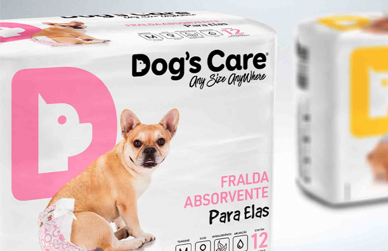
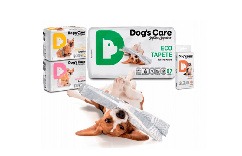
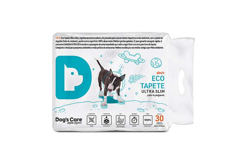
It was within this context of growth and portfolio expansion that SB\Design, under the creative direction of Sandro Bianco, was responsible for redesigning the Dog's Care logo and completely reformulating its packaging line. The challenge went beyond creating new layouts. Products with different functions, dimensions, formats, technical information, and commercial needs needed to be recognized as members of the same family. The work consisted, therefore, in building a true visual brand system capable of establishing unity without eliminating necessary differences between categories, products, and variants.
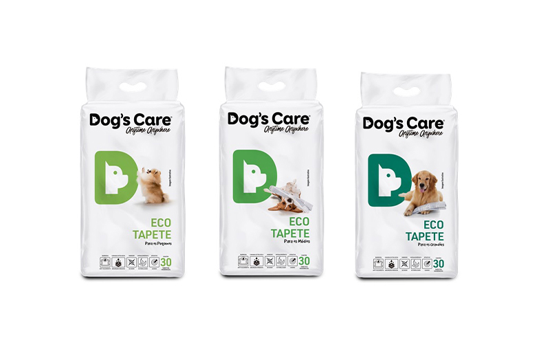
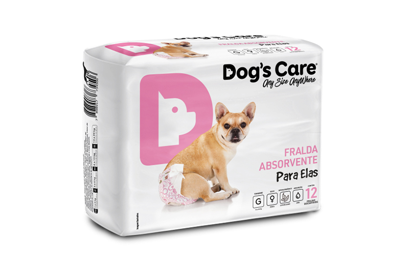
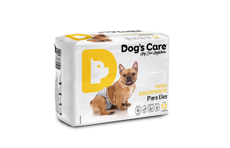
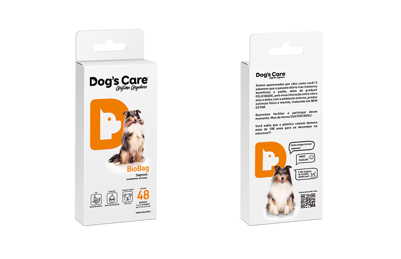
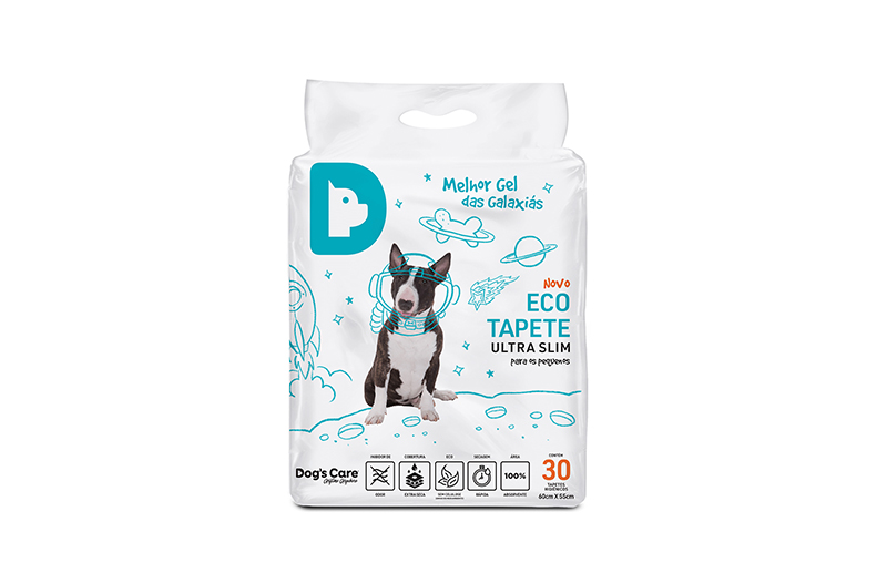
The solution developed by SB\Design and Sandro Bianco stems from a simple visual architecture with high recognition capacity. The new logo assumes an important presence on the packaging and immediately establishes the brand territory, while a consistent graphic structure organizes product names, function, benefits, technical information, images, and differentiation between variants. The strategic use of colors creates navigation codes between products and lines, allowing consumers to quickly recognize differences at the point of sale without breaking the family unity. The result is a system in which each package has its own personality, but all clearly belong to the same universe.
This principle is particularly important in packaging design for the pet market. A package must establish an emotional relationship with the guardian while simultaneously communicating functional information with extreme clarity. It must be understood quickly for which animal the product was developed, what problem it solves, how it should be used, what its benefits are, and which variant is appropriate. SB\Design worked on this dual dimension by creating a more approachable, human, and accessible visual language without abandoning the technical organization necessary for animal care products.
The redesign also needed to function as a system prepared to grow. Rather than designing each package as an independent piece, Sandro Bianco structured a design logic capable of receiving new SKUs, sizes, categories, and line extensions while preserving hierarchy, recognition, and consistency. This type of architecture is fundamental in large-scale packaging projects: the larger the portfolio, the more important clear rules become to allow diversity within a common structure.
The project must also be understood within the transformation of the market itself. The relationship of Brazilian families with their animals has changed profoundly and made the pet industry one of enormous economic relevance. According to Abempet, the Brazilian pet market generated R$ 75.4 billion in 2024, a 9.6% increase compared to the previous year. The entity also points to a statistical average of 1.8 pets per residence in Brazil, showing how dogs, cats, and other animals have definitively become part of Brazilian family structures.
This growth also expanded the number of brands, categories, and products competing for attention in pet shops, supermarkets, marketplaces, and digital environments. Packaging therefore exercises a strategic function: it must identify, explain, differentiate, and sell in mere seconds. For a brand with different solutions like Dog's Care, branding and packaging design must function as a single information architecture.
Dog's Care's own evolution demonstrates this complexity. Currently, its portfolio includes diapers and disposable products, training solutions, hygiene, dermocosmetics, cat products, supplements, and other care and wellness categories. The company also maintains operations focused on the B2B market, with an exclusive area for pet industry companies and specific materials for retailers. This diversity makes even more evident the importance of building an identity capable of organizing different product families without fragmenting brand perception.
The Dog's Care project represents an important characteristic of Sandro Bianco and SB\Design's work in packaging design: understanding packaging as a system and not as a surface. Before deciding on colors, photographs, or graphic elements, it is necessary to understand the portfolio architecture, the relationship between products, the information hierarchy, consumer behavior, and the real conditions in which those packages will be found.
It was this vision that allowed connecting logo redesign, visual identity, packaging design, and portfolio architecture into a single project. SB\Design's work created a structure capable of transforming different packages into consistent touchpoints of the same brand, strengthening recognition and facilitating consumer navigation between products.
For Sandro Bianco, designing a package also means thinking about what happens when it leaves the computer screen: how it will be produced, how it will behave in different formats, how it will look next to competitors, how it will be photographed for an e-commerce platform, how it will function in a small thumbnail on a mobile phone screen, and most importantly, how hundreds of individual decisions can continue to seem like part of a single idea.
Dog's Care synthesizes this approach. SB\Design transformed portfolio complexity into a coherent, recognizable, and scalable visual system, using branding and packaging design as instruments to organize information, strengthen the brand, and prepare its identity to continue growing alongside the Brazilian pet market.