In 2020, during one of the most complex periods in recent Brazilian history, Amnesty International Brazil launched Toda Friday é Black, a campaign created to transform Black Friday into a starting point for a much larger discussion: the permanent confrontation of structural racism and human rights violations in the country. The initiative was launched on November 27, 2020 and proposed something beyond a one-off communication action: transforming every Friday into opportunities for anti-racist reflection, positioning and mobilization. According to the campaign's official material, it was Amnesty International Brazil's largest anti-racist initiative since Jovem Negro Vivo, in 2014.
The campaign was born from a collective construction that brought together Amnesty International Brazil and organizations directly linked to the fight for the rights of the black population, including Geledés -- Instituto da Mulher Negra, Criola, Olodum, CEDENPA and CONAQ. The strategy used the enormous visibility of Black Friday to provoke a reversal of meaning: displacing the term "Black" from the consumption universe to a conversation about black population, consciousness, racial equality and human rights. "Toda Friday é Black", "Toda sexta é preta", "Toda sexta é nossa" and "Toda sexta é consciência" became a mobilization vocabulary that could continue to exist long after that Friday.
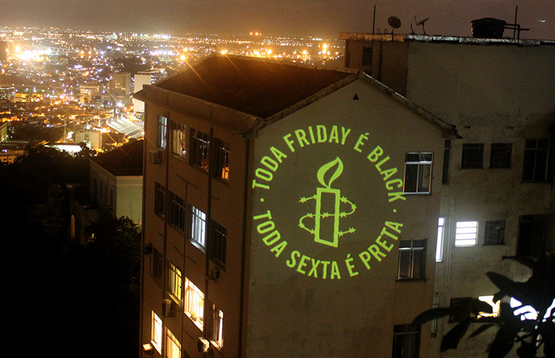
Within this collective construction, Sandro Bianco and SB\Design were responsible for the visual dimension of the project, in partnership with Mauro Silva from RioHux, developing a language capable of transforming the campaign's message into presence. More than creating isolated pieces, the challenge was to build a direct, recognizable and sufficiently flexible visual system to cross different media, scales and situations. The identity needed to function on a mobile screen, on social networks, in digital content and, at the same time, occupy entire facades architecturally through large urban projections.
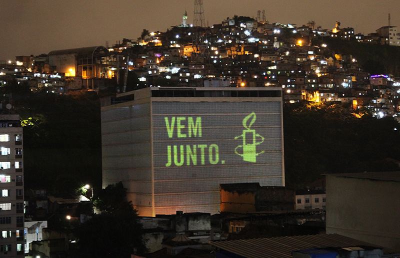
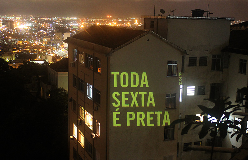
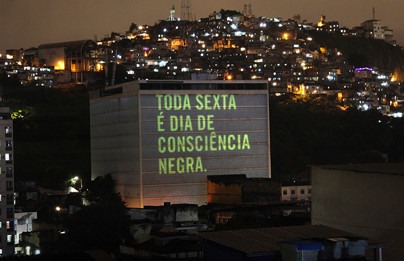
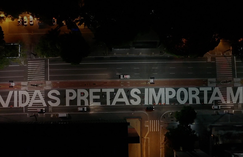
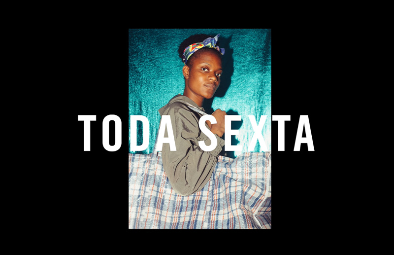
This change of scale became one of the strongest characteristics of the project. In the projections carried out in São Paulo and Rio de Janeiro, phrases like "Toda sexta é preta", "Toda sexta é dia de consciência negra", "Toda sexta é consciência. Toda sexta é preta. Toda Friday é Black" and "Every Friday is Black" ceased to be merely graphic messages and began to physically occupy the cities' landscape. Design functioned as voice: typography, contrast, scale, repetition and urban space transformed a message into an event. Amnesty International's own release recorded the projections as part of the campaign's launch actions.
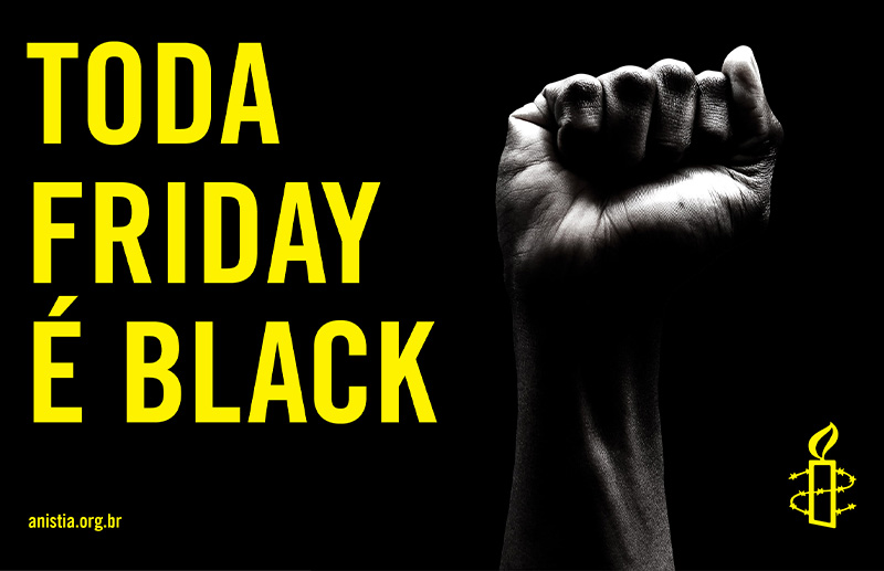
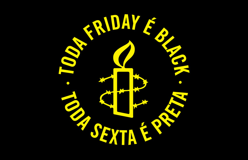
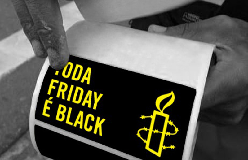
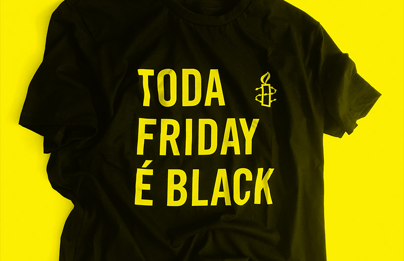
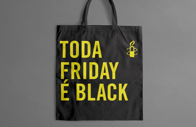
The work developed by SB\Design, under the direction of Sandro Bianco and in partnership with Mauro Silva from RioHux, started from a fundamental premise: in a project of this nature, design should not dispute prominence with the cause. It needed to amplify it. The visual language was built to be striking, simple, reproducible and immediately understandable. Black, the yellow associated with Amnesty International's identity, high-impact typography and the symbol developed for the campaign formed a graphic system that could migrate between projections, digital pieces, social networks, mobilization materials and audiovisual content without losing its identity.
This logic is particularly important within the trajectory of SB\Design and Sandro Bianco. The project demonstrates a conception of design that is not limited to the aesthetic construction of a visual identity. Design can organize a complex message, establish hierarchies, transform strategy into language and create systems capable of functioning in different contexts. In Toda Friday é Black, branding, art direction, communication, culture, urban space and social impact became part of the same system.
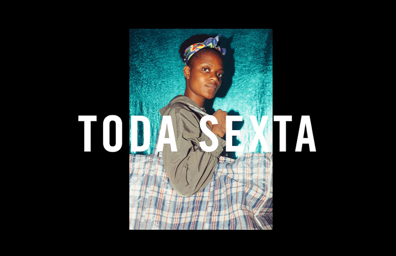
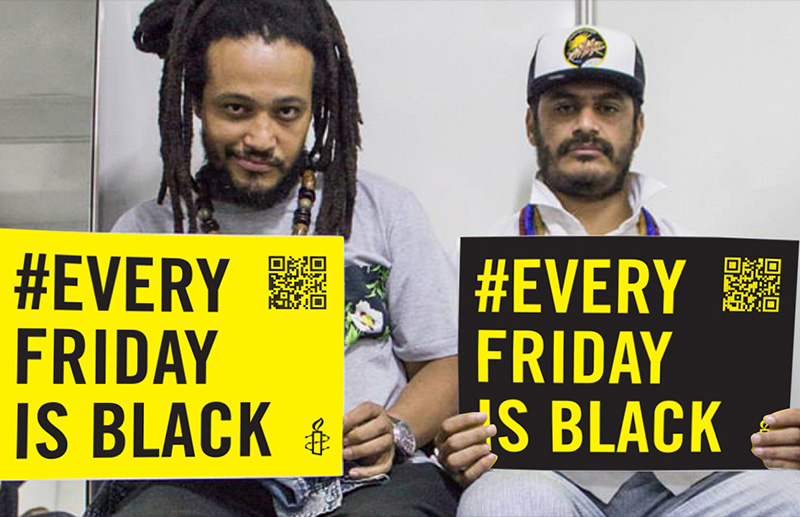
The campaign also featured a manifesto video narrated by actress Juliana Alves, as well as weekly content, podcasts, live streams, virtual debates, a landing page, free distribution materials and the hashtags #TodaFridayEBlack and #EveryFridayIsBlack, the latter designed to expand the participation of anti-racist activists and institutions internationally.
Perhaps the most powerful part of the strategy lies precisely in the transformation of a date into behavior. The campaign was not intended to end when Black Friday ended. The original proposal called for a year of weekly discussions and mobilizations against racism, creating a permanent platform for awareness and bringing together organizations from the black movement, activists and people interested in contributing to the construction of racial justice in Brazil.
The visual dimension created by SB\Design in partnership with RioHux needed, therefore, to survive the launch. It was not an identity for a single event, but a language for an idea that should continue to circulate, be shared, appropriated and recognized. This characteristic transforms Toda Friday é Black into a particularly relevant project within Sandro Bianco's work: an example of how strategy, visual identity and art direction can build communication infrastructure for a large-scale social initiative.
The campaign gained repercussion in the national press and was highlighted, among other outlets, by Mônica Bergamo's column in Folha de S.Paulo, which reported on its launch and its proposal to keep the discussion about racism active through weekly actions. More importantly, the initiative continued to evolve after 2020. Amnesty International Brazil subsequently transformed the knowledge produced during the campaign into content and materials aimed at anti-racist practice, extending the life of the project beyond its initial launch.