Creating an identity for a music festival is very different from designing a logo. A brand of this kind must carry culture, memory, behavior and emotion before the first chord is even played. This was exactly the challenge that gave rise to C6 no Rock, the new festival promoted by C6 Bank, an initiative born to connect major national and international artists to an experience built around music, culture and innovation. The opportunity reached SB\Design through Dueto Produções, the company responsible for producing the festival and a strategic partner of C6 Bank in building the project. From this brief, Sandro Bianco and Roberto Cipolla developed the entire strategy and visual identity of the brand, the result of approximately two months of research, historical references and dozens of conceptual studies until reaching a language capable of translating the personality of the event. More than creating a logo, the objective was to develop an identity capable of growing alongside the festival and becoming a brand asset for the years to come.
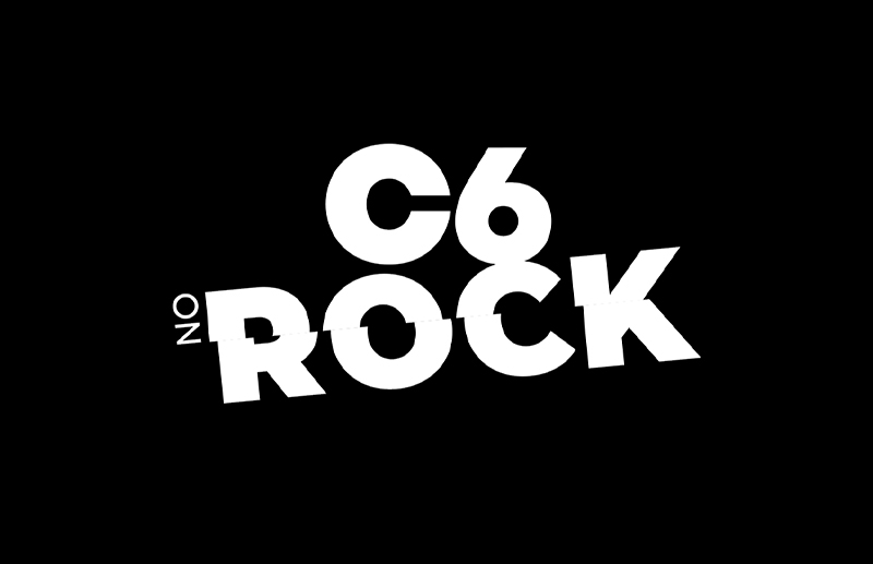
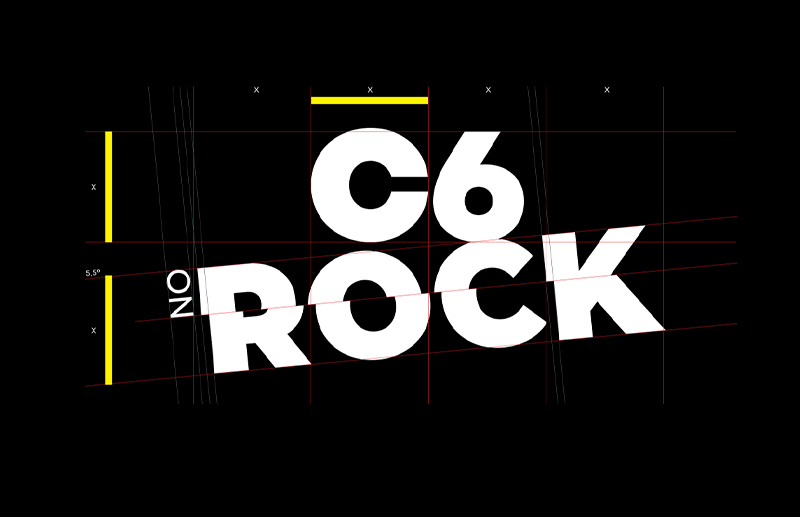
The starting point was never to design a beautiful brand. The concern was to find a language that represented the very DNA of rock. The process delved deeply into the history of the genre, studying everything from the birth of Rock and Roll in the 1950s, through Classic Rock, Punk Rock, Hardcore, Glam Rock, Garage Rock, Alternative Rock, Grunge and Indie Rock, to understand how each movement helped build its own aesthetic over more than seven decades. This entire repertoire was condensed into a contemporary visual system that translates the energy, attitude and authenticity present in the rock universe without resorting to the clichés normally associated with the genre. The brand is born from culture, not from trend. Its typographic construction, the tilts, the distortions, the contrast between order and rupture and the presence of graphic elements inspired by fanzines, street posters, photocopies, collages and handcrafted prints dialogue directly with the Do It Yourself philosophy that shaped an important part of the visual identity of alternative rock.
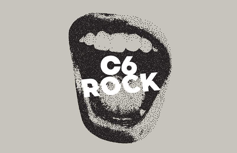
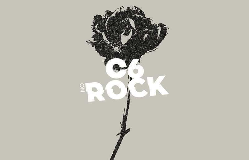
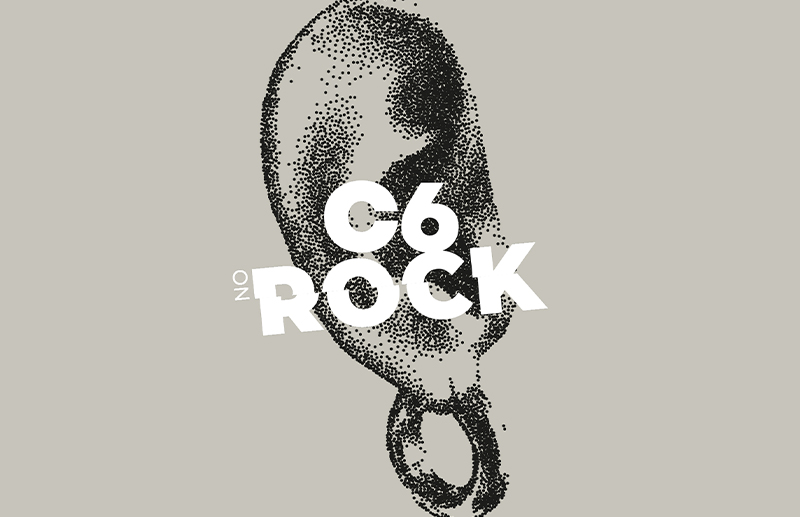
During the development of the identity, Sandro Bianco conducted an extensive process of graphic exploration, producing dozens of visual directions before defining the final solution. Each alternative investigated different readings of rock culture: roses, mouths, skulls, pins, typographic elements, graphic interventions and symbols that helped build a consistent visual repertoire for the project. More than presenting aesthetic proposals, each study was accompanied by a strategic rationale capable of explaining its relationship with the history of music, design and behavior. This methodology is part of how SB\Design develops brands: first by deeply understanding the cultural territory in which they will exist, and only then transforming that knowledge into visual language.
The creation of C6 no Rock also reinforces a long-standing partnership between Sandro Bianco and Roberto Cipolla, professionals who share decades of collaboration on projects for brands in the worlds of culture, entertainment, fashion and the luxury market. In this project, Dueto Produções was responsible for connecting the creative team to C6 Bank and conducting the entire festival production, while SB\Design focused its efforts on building the visual identity and strategic thinking of the brand. The result is a visual system prepared to unfold into campaigns, digital experiences, communication, signage, merchandising, products, stages and on-site activations, maintaining personality and recognition at any scale.
For Sandro Bianco, C6 no Rock represents exactly the kind of project that synthesizes his professional trajectory. Throughout more than three decades developing projects for some of the largest brands in Brazil and the world, he has always sought to create visual systems capable of uniting strategy, culture and art direction in a single narrative. The identity of C6 no Rock demonstrates this process clearly: a brand built from research, repertoire and strategic thinking, capable of transforming a new festival into a consistent cultural platform. More than a logo, it is the construction of a visual heritage for an initiative that is born with the potential to occupy a relevant place in the Brazilian music calendar, reinforcing the work of SB\Design and Sandro Bianco in creating identities for major brands, festivals and cultural experiences.