Some projects begin with a brief. Others begin with a vision. B Hotel was born from the ambition to create a new reference for Brazilian hospitality, with architecture as the central element of the experience. To give form to this idea, the project invited Isay Weinfeld, one of Brazil's most internationally recognized architects, whose work is marked by rigorous proportions, precision of detail, and an elegance built through restraint, not excess.
When SB\Design initiated the project in 2014, the architecture had already established a very clear direction. The challenge was not to create a visual identity capable of attracting attention, but to develop a brand that shared exactly the same principles as the building. The identity needed to emerge from the architecture, not be applied to it.
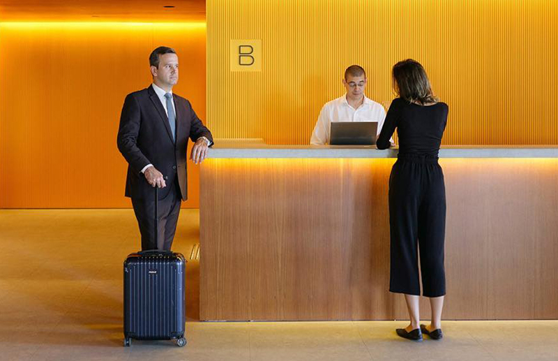
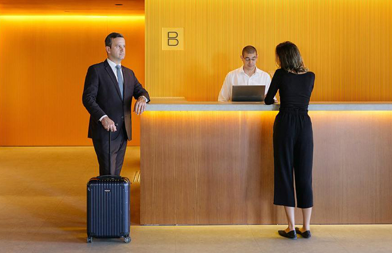
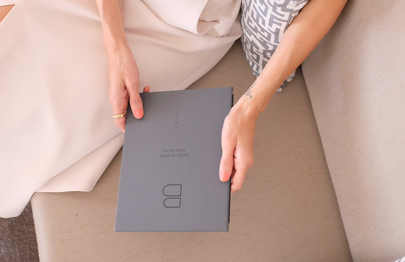
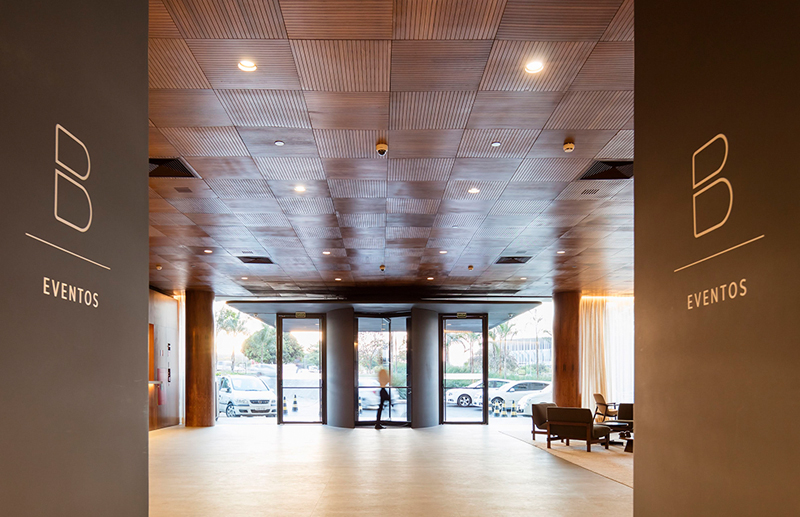
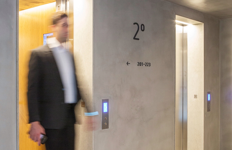
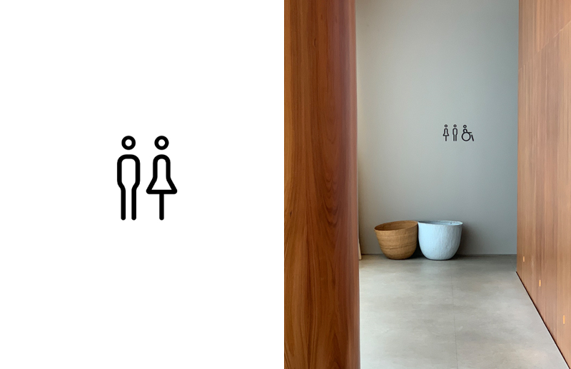
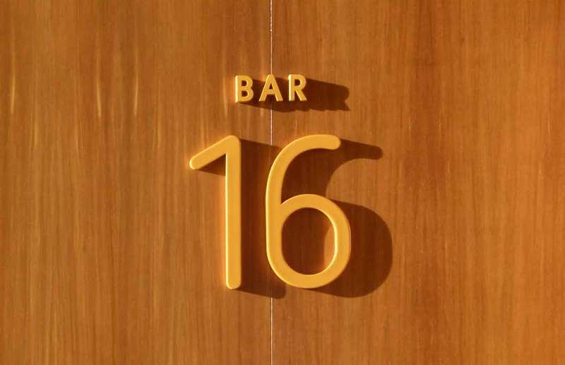
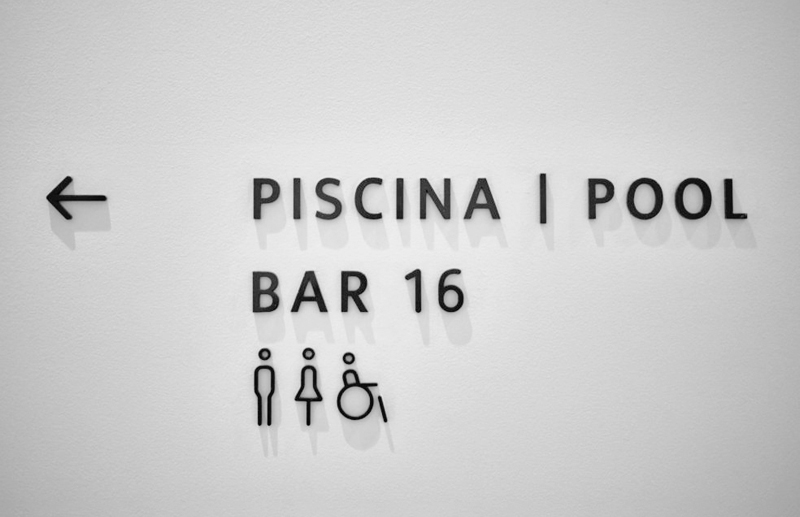
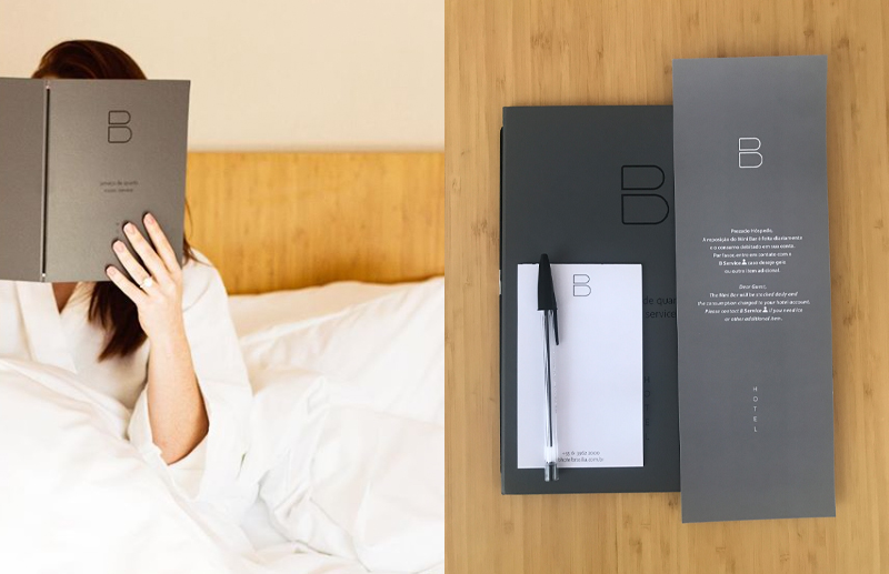
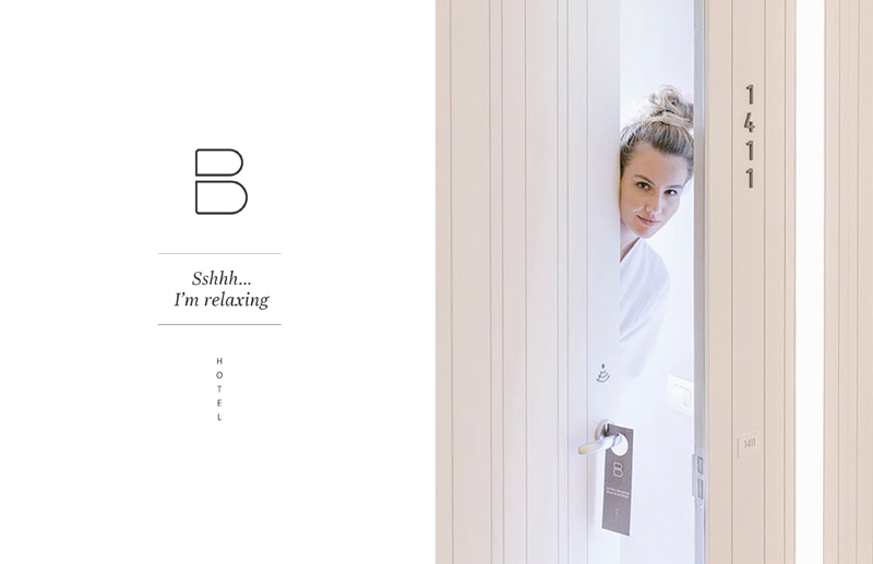
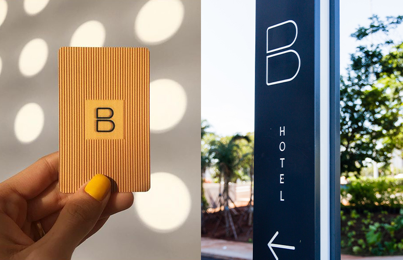
In partnership with Roberto Cipolla, SB\Design was responsible for the creation of the name, brand strategy, visual identity, and the entire system of internal and external signage for the hotel. From the facade to the rooms, from institutional communication to wayfinding, every element was conceived to be part of the spatial experience and to naturally dialogue with the architectural language of the project.
Much before the logo, there was an idea.
The client carried with him the desire for the development to be known simply as B. The simplicity of this intention concealed a complex challenge: transforming a single letter into a brand capable of representing an international standard hotel while maintaining the sophistication necessary to dialogue with Isay Weinfeld's architecture.
Throughout the process, dozens of alternatives were explored. The result preserved what made the concept so powerful from the beginning: its ability to communicate a great deal with very little.
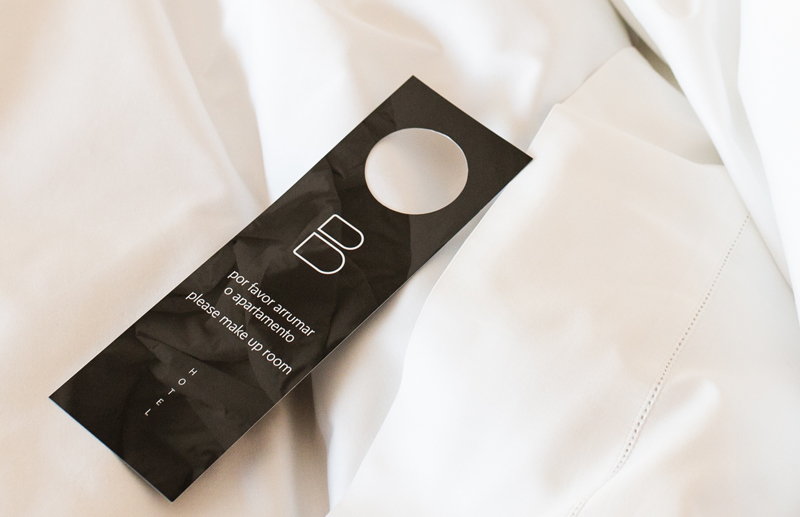
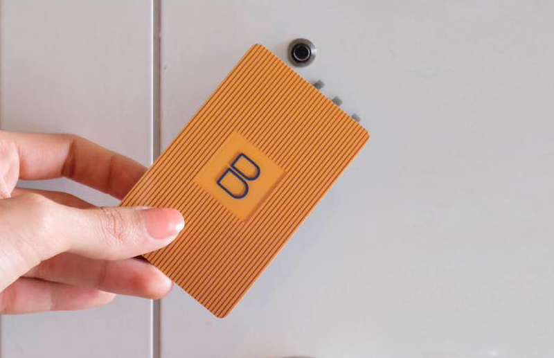
More than a name, B Hotel became an architectural element. The monogram came to integrate the facade, signage, printed materials, and countless details of the guest experience, functioning as a natural extension of the architecture.
Designing an identity for a work by Isay Weinfeld required understanding his design philosophy. His architecture eliminates everything that is superfluous. Proportion, light, materiality, and precision replace any unnecessary gesture.
The identity developed by SB\Design followed exactly this logic. Instead of competing with the building, the graphic system shares the same principles: clarity, balance, visual silence, and permanence.
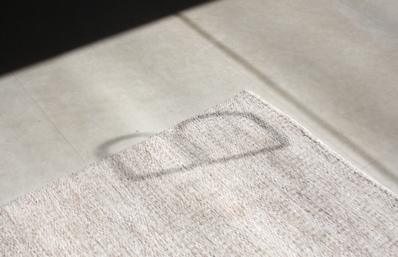
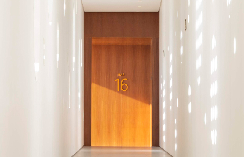
The typography, monogram, materials, signage, and information hierarchy were designed to coexist with the architecture in an almost invisible way. The goal was never to highlight the identity, but to make it seem inevitable—as if it had always belonged to the building.
The project encompassed naming, brand strategy, visual identity, institutional applications, and a complete system of internal and external signage.
More than a set of graphic pieces, the result was an integrated system where branding, wayfinding, and architecture began to operate as a single language.
B Hotel was inaugurated using the complete system developed by SB\Design. The identity became an inseparable part of the project's experience, demonstrating how design can act as a natural continuation of architecture.