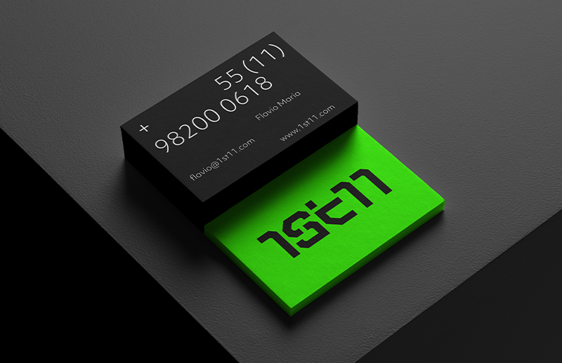
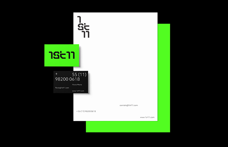
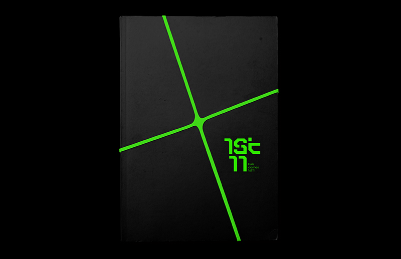
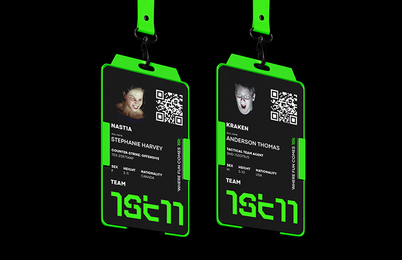
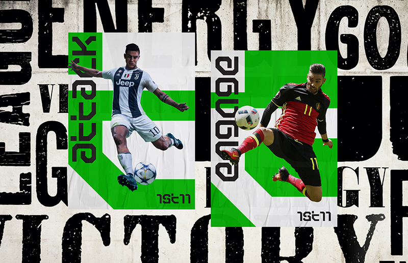
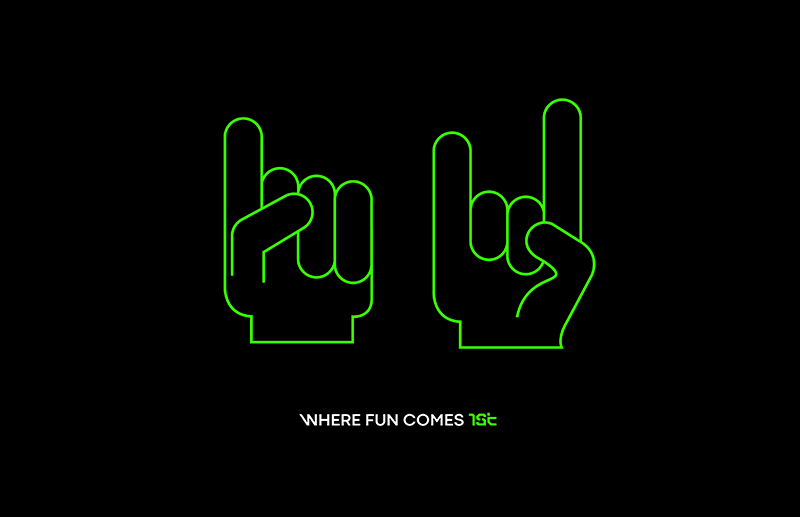
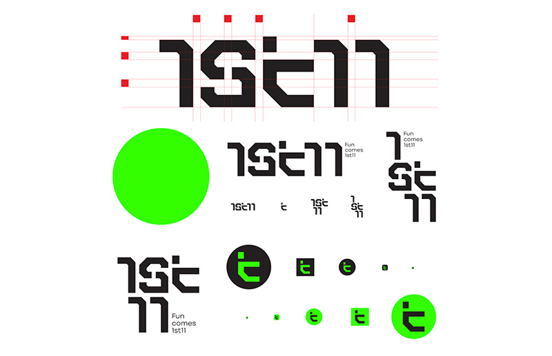
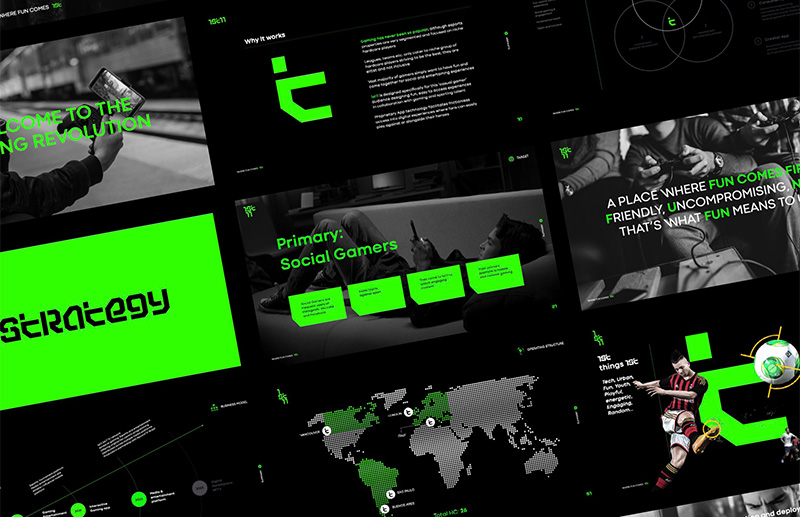
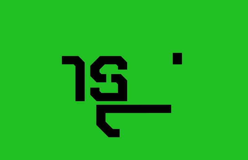
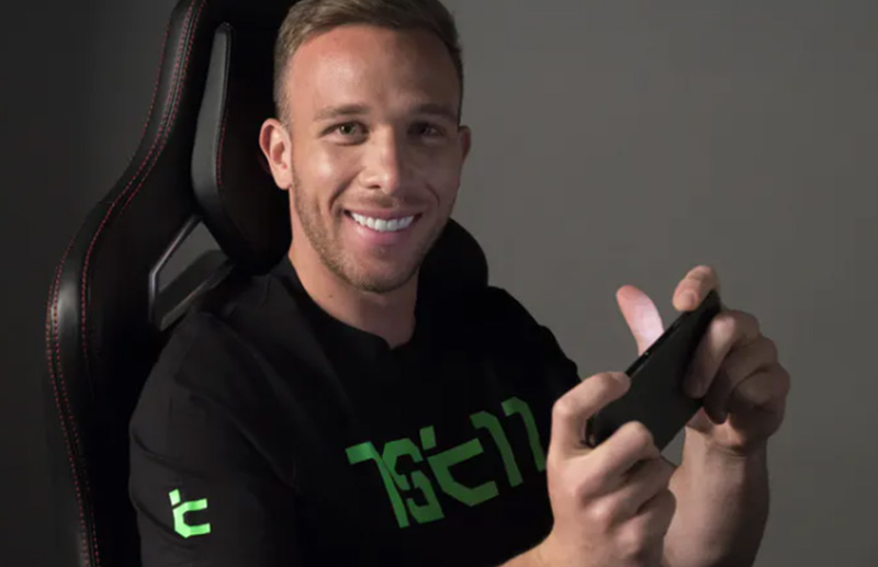
1ST11 was born as an international entertainment platform aimed at the gaming universe, connecting community, content, creators and digital experiences in a single ecosystem. SB\Design was responsible for the strategy and complete development of the brand's visual identity, creating a system prepared to represent a global platform and support its expansion across different markets. The challenge was to develop a visual identity capable of breaking with traditional gaming codes without losing connection to its community. The brand needed to be memorable, scalable and prepared to operate internationally across different platforms and touchpoints. SB\Design developed the complete brand strategy and visual identity system for 1ST11. The concept was built from the relationship between community, competition and entertainment, translating these values into contemporary, geometric and highly recognizable visual language. The symbol was inspired by the hand position used by players during matches, transforming a universal gesture from the gaming community into a proprietary graphic element. The identity represents the community's journey: connect, compete and conquer. The visual language combines geometric shapes, modular typography and striking contrasts to convey innovation, speed and energy, avoiding the clichés normally associated with esports brands and betting on a contemporary, clean and proprietary aesthetic. The project established a consistent and scalable visual identity for an international digital entertainment platform, creating a solid foundation for its communication across different markets and strengthening its positioning within the gaming community.