Patio Brasil is a Brazilian brand specializing in high-end outdoor furniture, with its own manufacturing in Uberaba, Minas Gerais, and over 25 years of experience creating furniture for outdoor spaces, leisure and gatherings. Its universe combines design, architecture, landscape design, technology, premium materials and artisanal production. The brand works with Brazilian designers such as Sérgio Matos, Deborah Roig, Samuel Lamas, Lattoog, Marina Linhares and Suite Arquitetos, building collections that bring together furniture, nature and different ways of living outdoors. Patio Brasil itself defines its work based on the idea of transforming the concept of outdoor living into sophisticated experiences, producing pieces for residences, hotels, restaurants, developments, corporate environments and architecture projects.
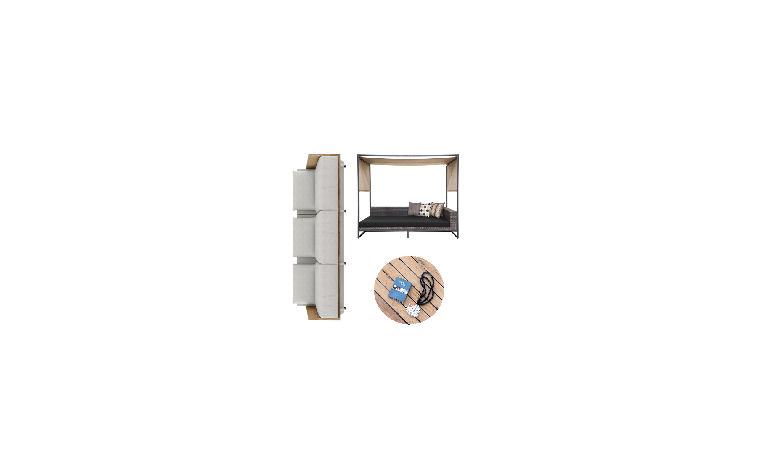
The relationship between Cristiana Brasil, who leads Patio Brasil, Sandro Bianco and SB\Design gave rise to the project of redesigning the brand and its visual identity. The challenge was not simply to replace a logo, but to find a visual synthesis capable of representing a consolidated Brazilian company in the luxury outdoor furniture segment and, at the same time, to create an identity subtle enough to coexist with products of strong formal presence. The solution developed by Sandro Bianco and SB\Design stems precisely from the furniture itself: the geometry of the symbol emerges from observing the structures, volumes, intersections, voids and proportions present in Patio Brasil pieces. A vertical bar, rectangular form and circle are reduced to their essential elements and reorganized into an abstract icon, creating a signature that can be perceived simultaneously as graphic composition, structure, object and space. The brand, therefore, does not seek to literally illustrate a piece of furniture; it transforms the constructive logic of furniture into visual language.
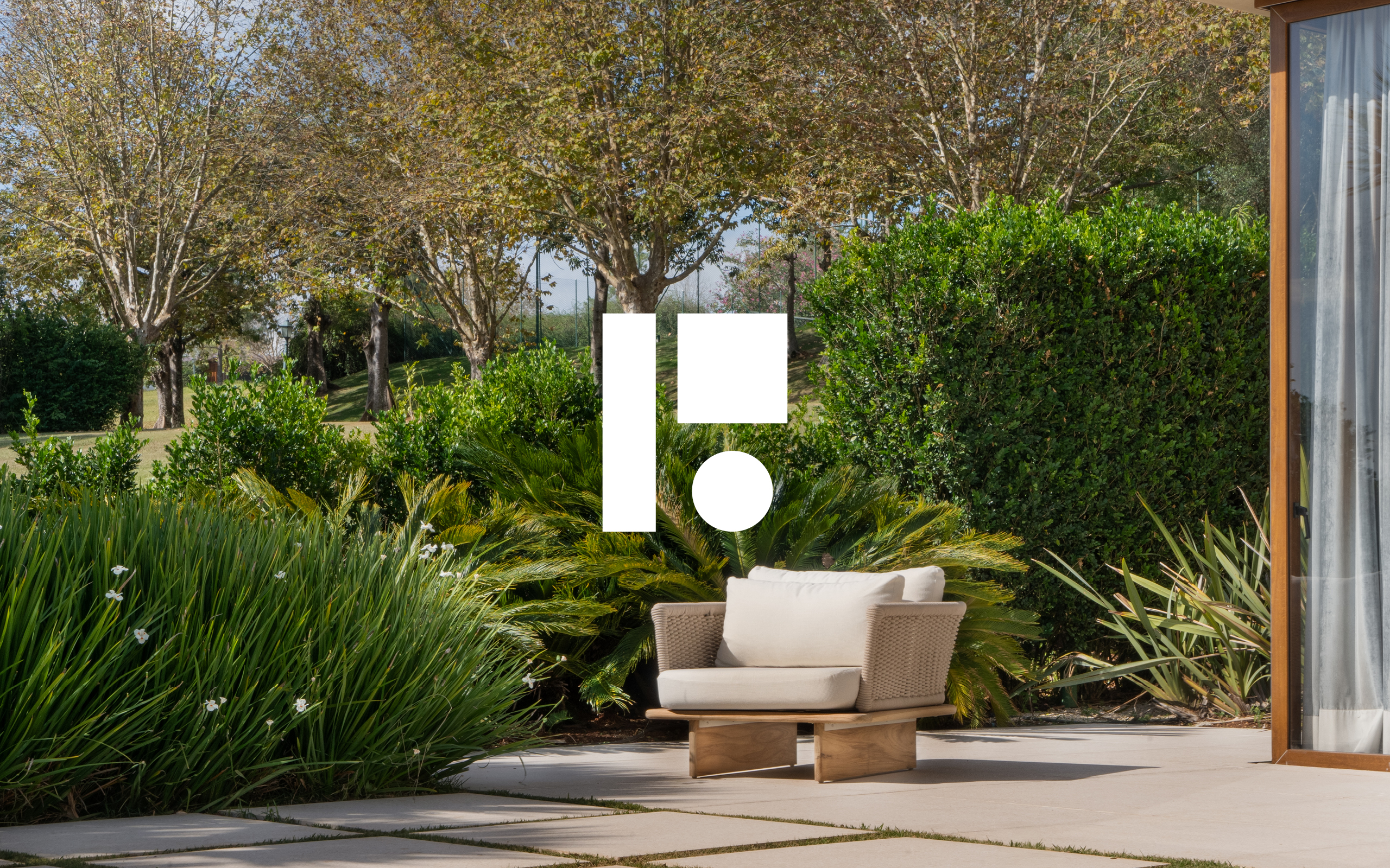
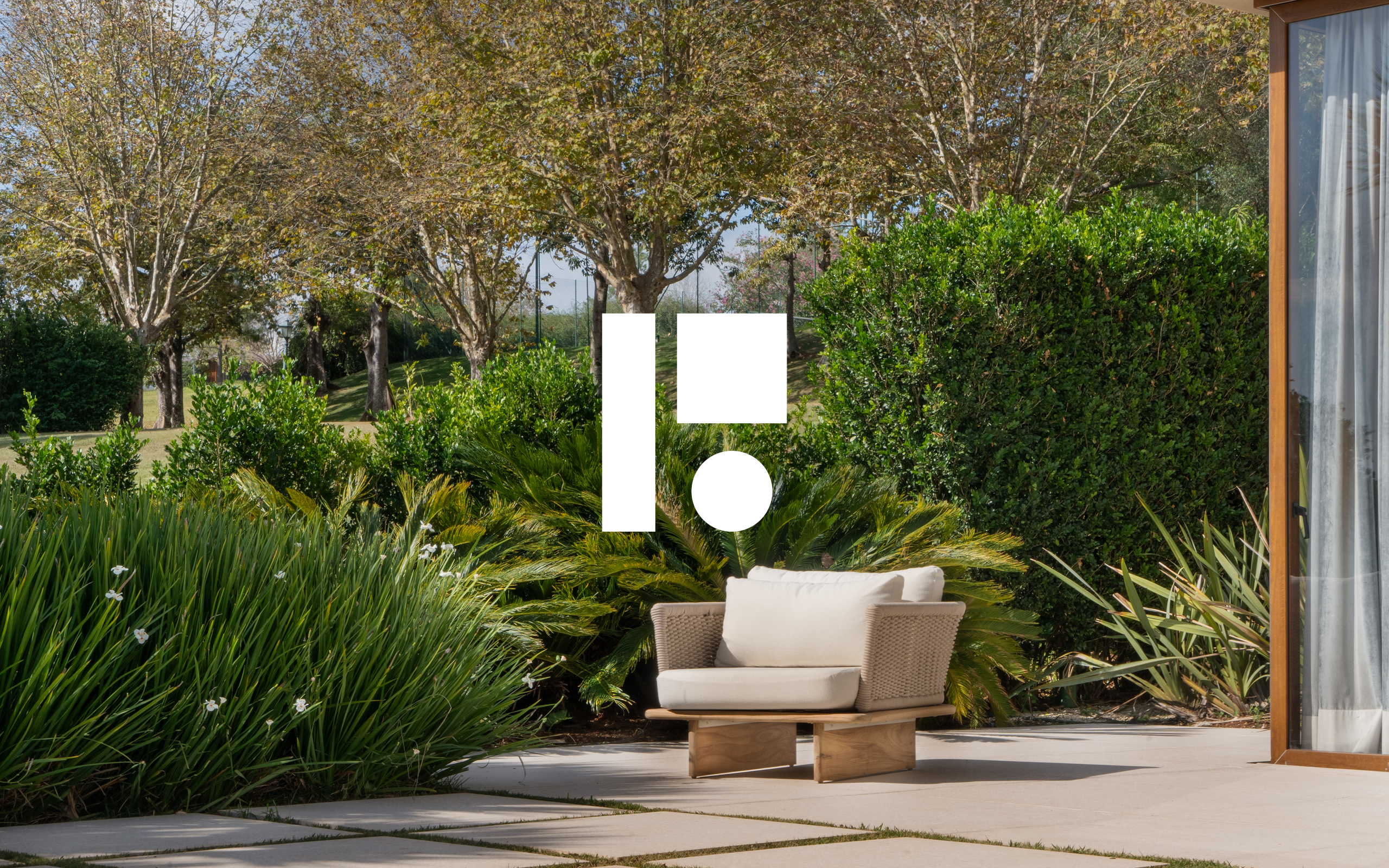
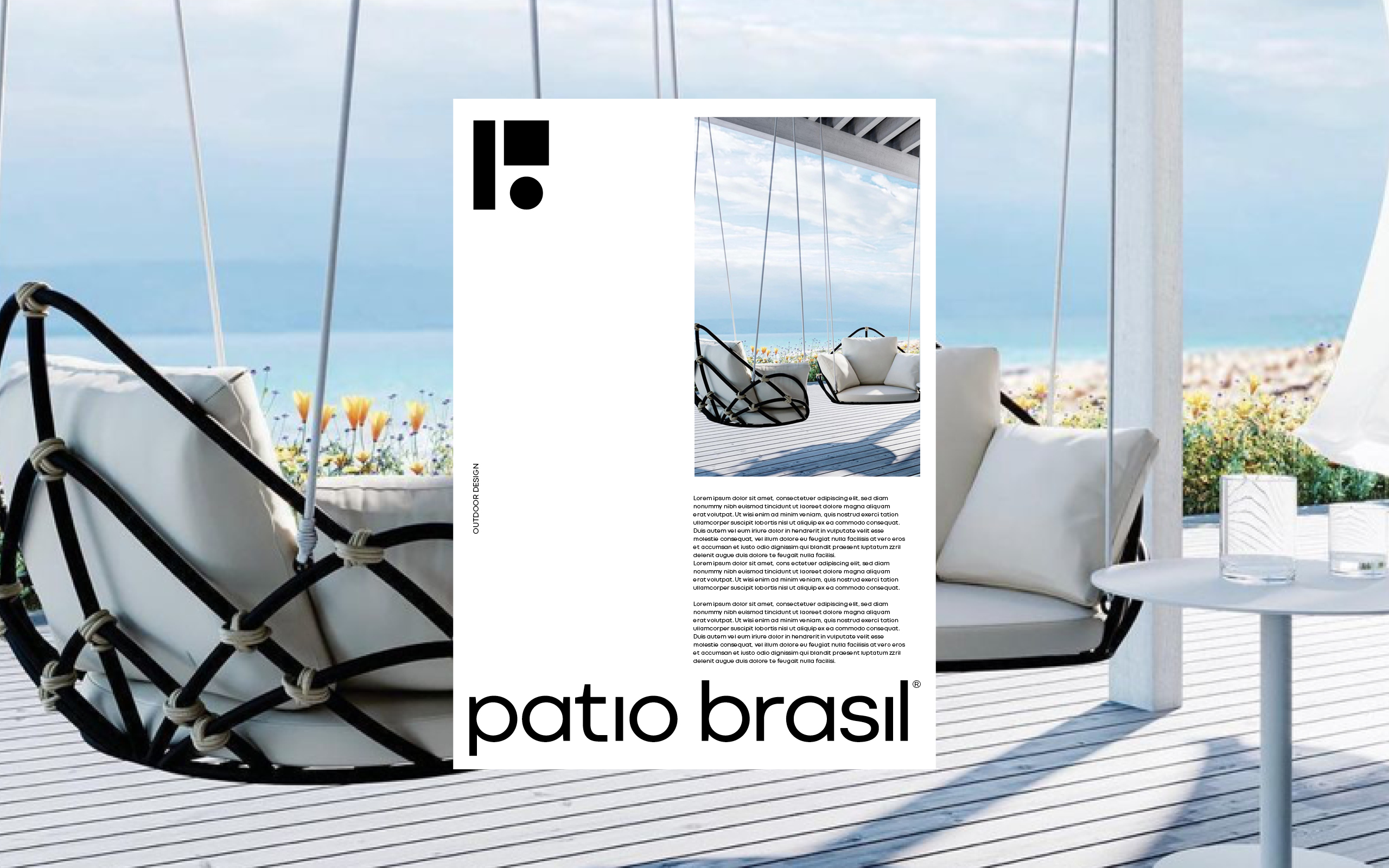
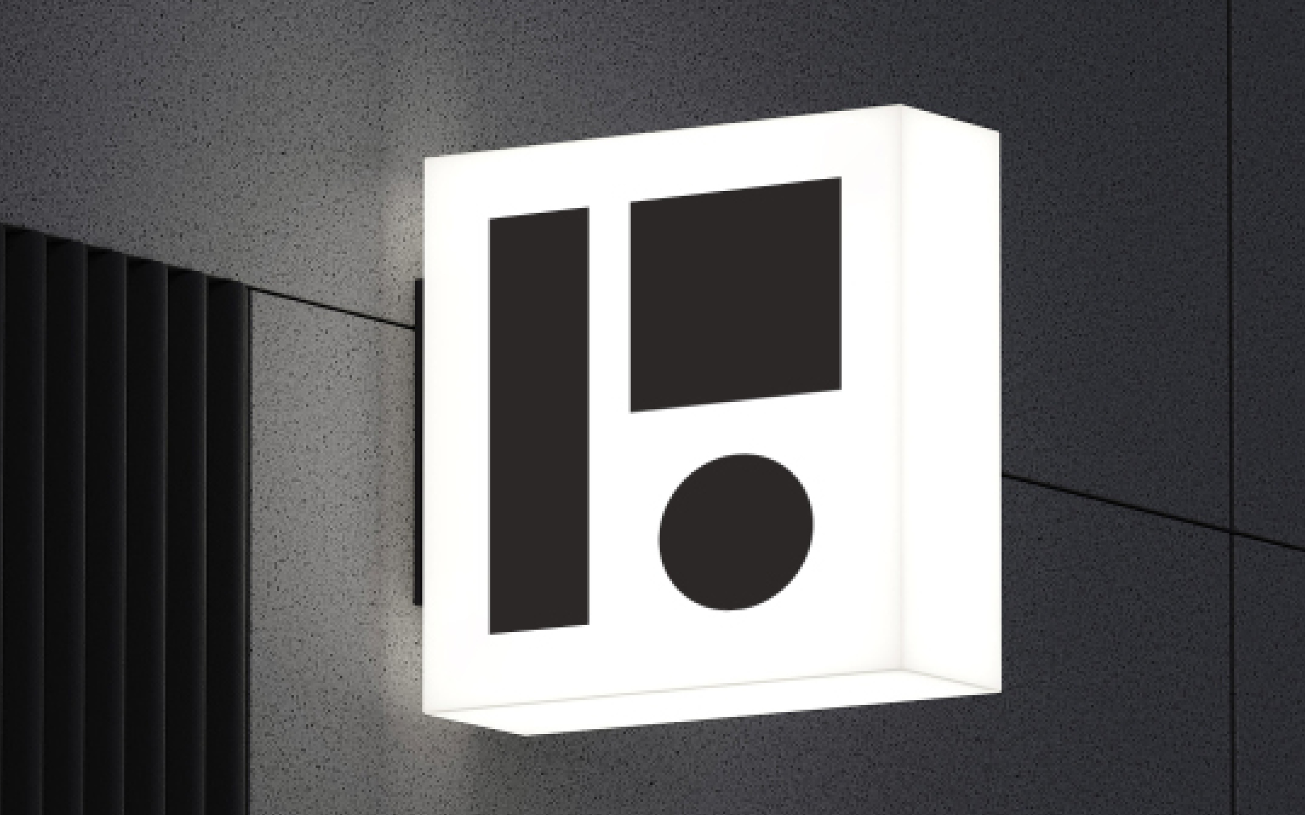
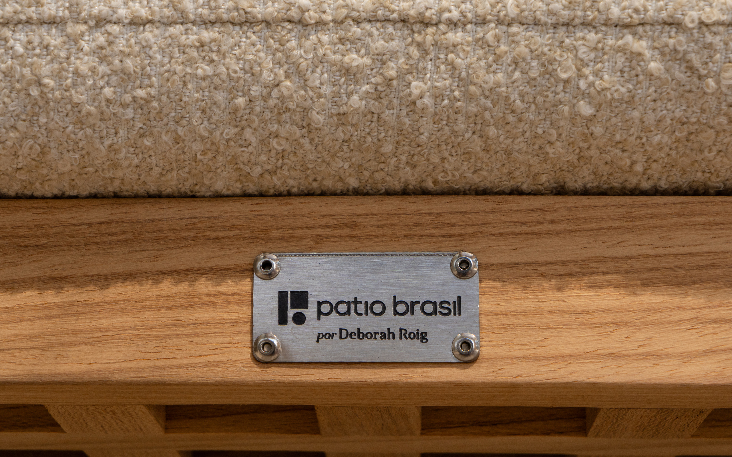
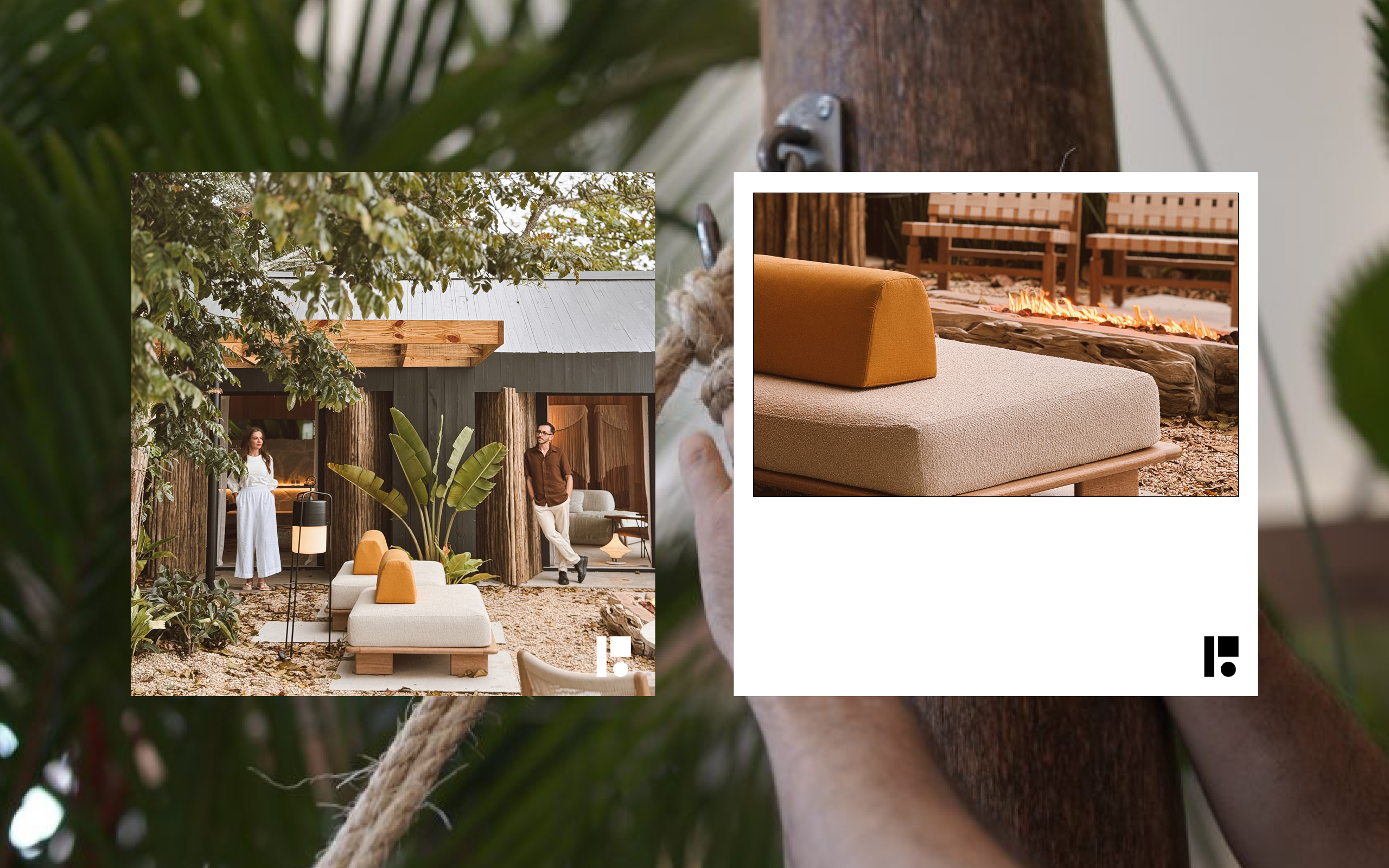
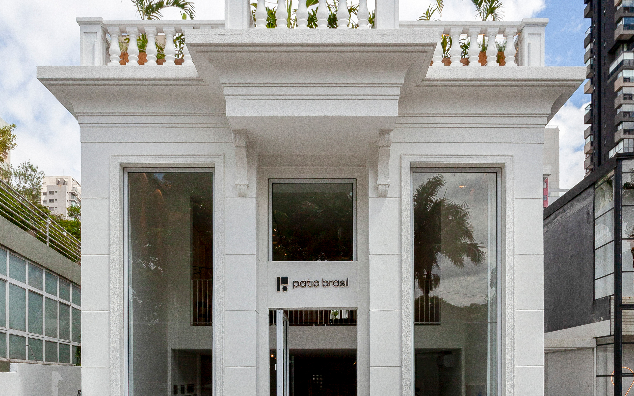
This principle establishes a direct relationship between branding and product. Rather than building a graphic universe independent of what the company manufactures, Sandro Bianco uses the design of Patio Brasil's own furniture as raw material for the identity system. The image in which the symbol appears overlaid on the products evidences this origin: apparently elementary forms find correspondences in the views, volumes and spatial relationships of the furniture. The result is an extremely simple symbol, recognizable at different scales and capable of functioning independently or accompanied by the Patio Brasil name. This formal reduction also enables very different applications—printed materials, digital communication, catalogs, metal plaques applied to furniture, signage, facades and environments—without losing identity.
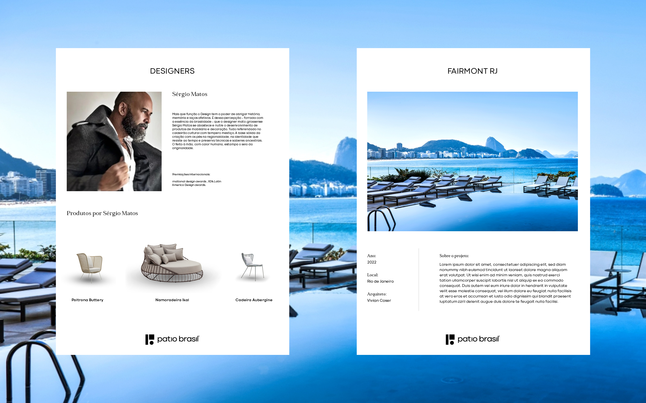
Minimalism is a recurring characteristic of Sandro Bianco's and SB\Design's work, but here it does not mean neutrality or absence of personality. It means removing what is not necessary to allow product, architecture, photography, materials and content to occupy the foreground. In Patio Brasil's identity, the graphic system works predominantly with black, white, large breathing areas, precise typography and controlled editorial composition. The identity does not compete for attention with the furniture: it creates a structure to enhance it. This logic appears both in the brand and in institutional materials, designer presentations, completed projects, stationery and physical applications.
At the same time, this quest for synthesis does not eliminate Brazilianness. It emerges in a less literal way, through the company's own repertoire: relationship with nature, outdoor living, craftsmanship, materials, landscape, architecture and Brazilian authorial design. The strategy finds correspondence in Patio Brasil's own portfolio. The Aubergine collection, by Sérgio Matos, for example, works with artisanal bindings and references to indigenous basketry; the Butterfly relates its drawing to natural fibers and the Morpho butterfly of the Atlantic Forest. The identity created by SB\Design avoids competing visually with this richness. Its role is to build a contemporary frame within which different expressions of Brazilian design can coexist.
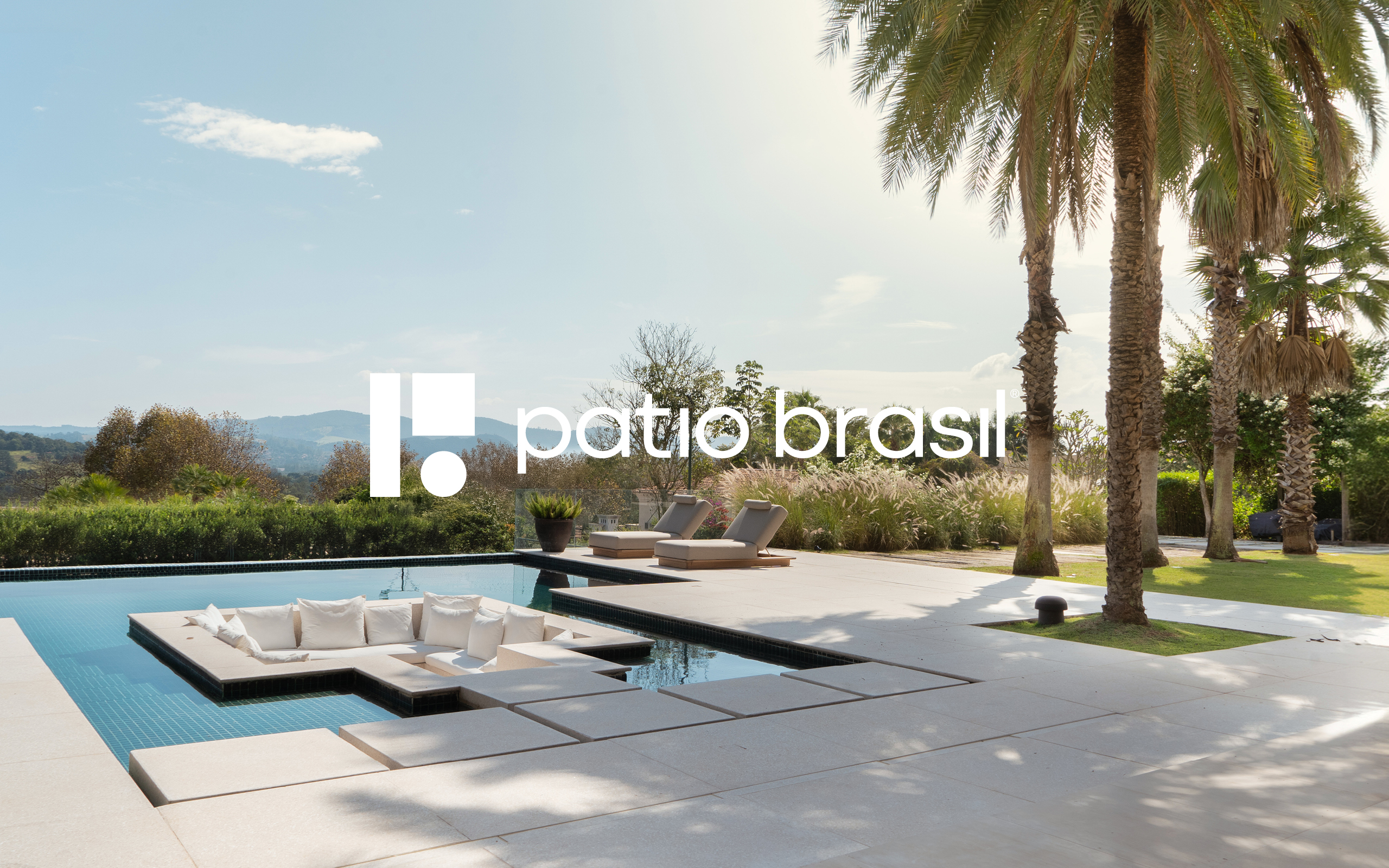
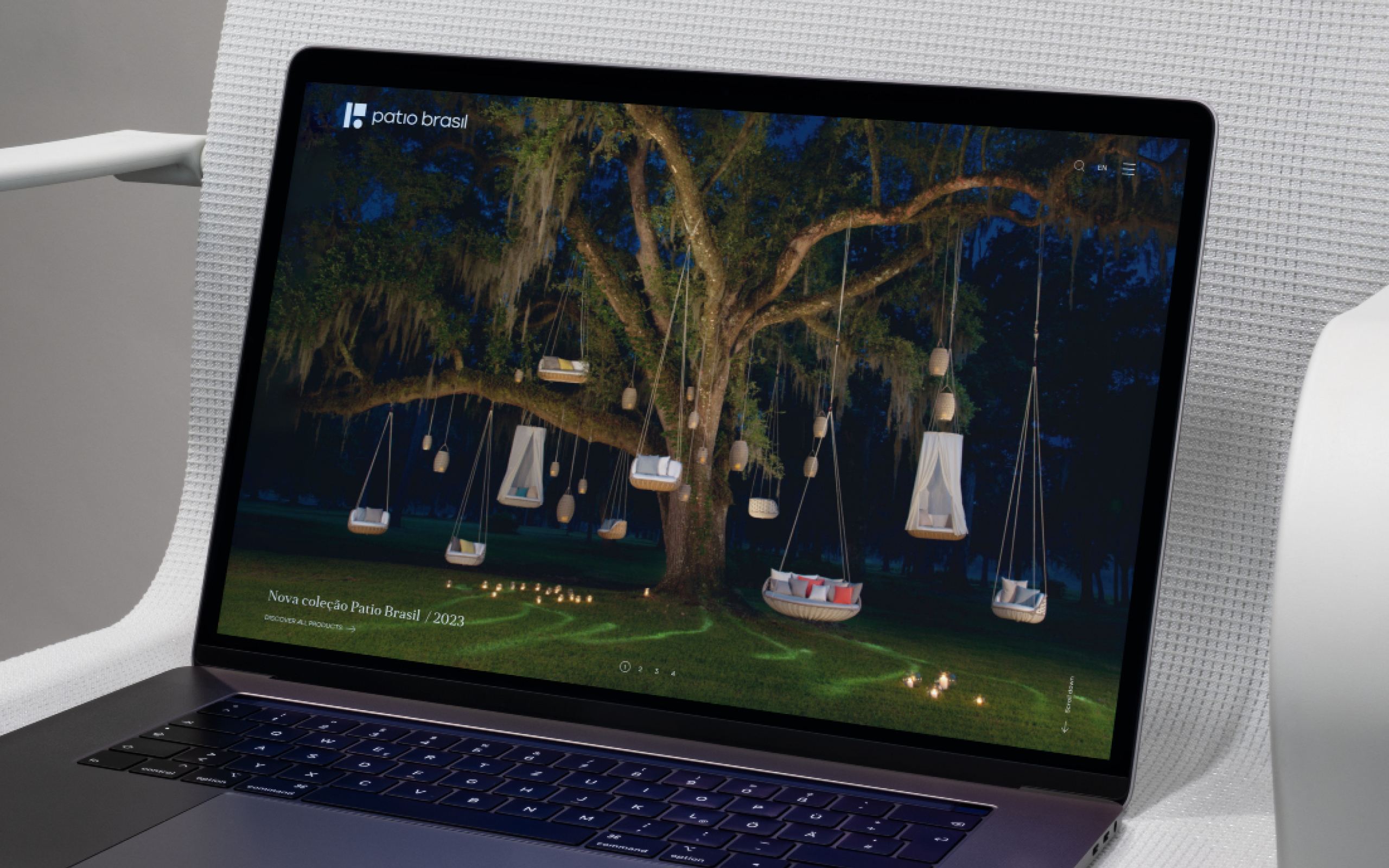
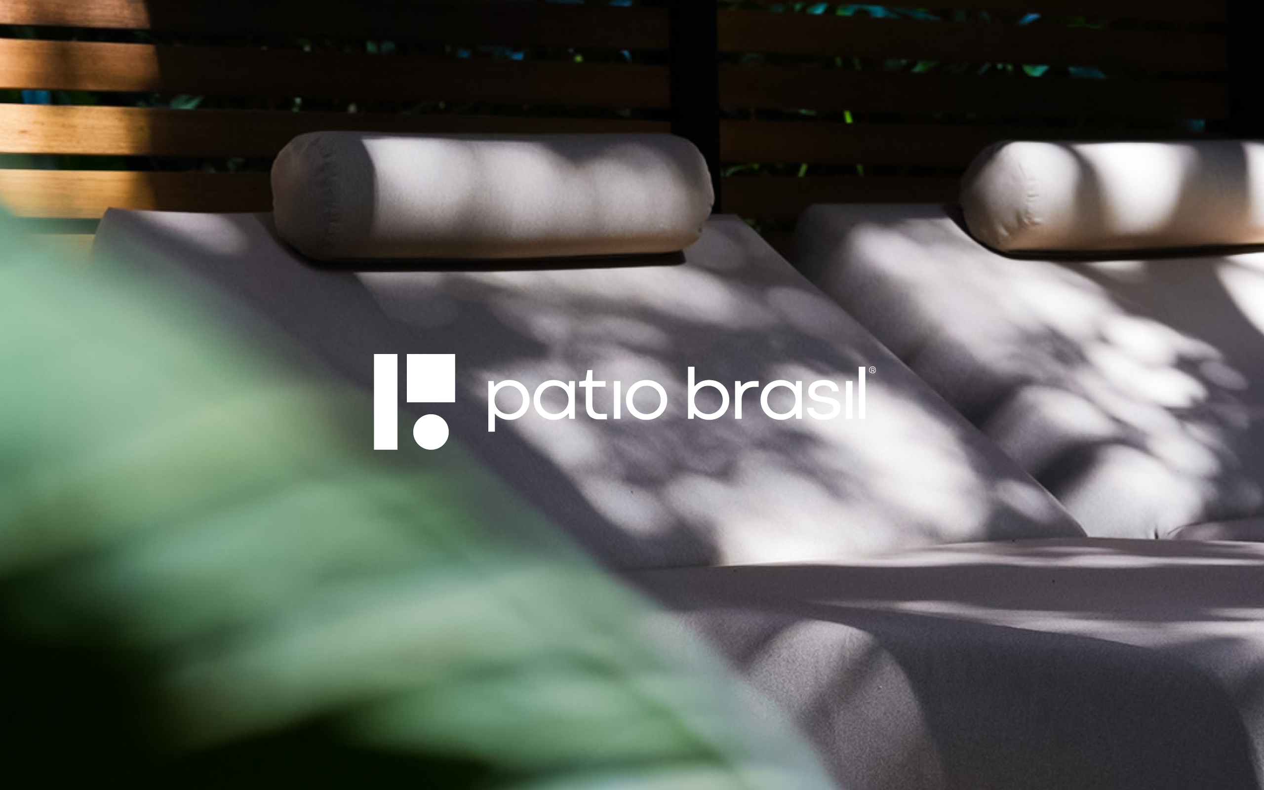
The system was designed to function from the institutional to the product level. The symbol can occupy large surfaces over photographs of architecture and landscape or appear reduced to just a few millimeters on a metal plate fixed directly to the furniture. The complete signature combines the icon with the patio brasil logotype, while the symbol gains enough autonomy to function as a proprietary element of the brand. Catalogs, designer sheets, project presentations, business cards, stationery and institutional communication follow the same logic of reduction, consistency and space. The identity ceases to be merely a logo and operates as a system capable of accompanying a company that brings together manufacturing, authorial design, architecture and outdoor culture.
The project by Sandro Bianco and SB\Design for Patio Brasil thus translates a central premise of SB\Design's work: the greater the quality and personality of the product, the less the identity needs to compete with it. Design organizes, connects and creates recognition. The furniture remains the protagonist. The brand functions as a signature. And the space between the two becomes part of the identity itself.