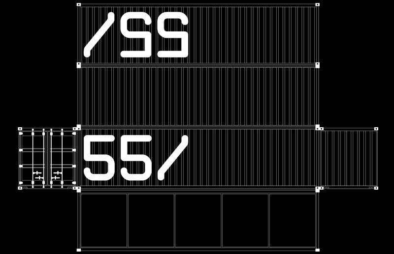
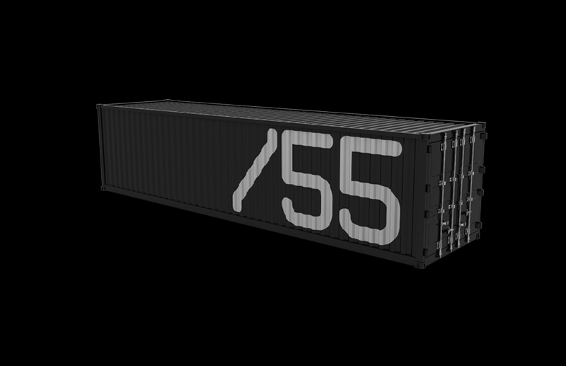
Created in 2004 by SB\Design for 55_Brands, a strategy and content consultancy founded by Hélio Rosas, the identity was built with the intention of creating a Brazilian brand with an essentially global language. Sandro Bianco developed the logo and the entire visual identity system from a simple and direct idea: transforming the universe of the container — an object that crosses countries, connects markets, transports value, and synthesizes logistics, organization, and intelligence — into a metaphor for strategy. The "55/" design was constructed with modular, industrial, and extremely synthetic geometry, capable of functioning both as an isolated signature and when applied at large scale across a container's surface. The language avoids decorative elements and works with proportion, repetition, structure, and formal reduction, bringing the project closer to a tradition of Scandinavian and modernist design that influences an important part of SB\Design's thinking: making fewer elements carry more meaning.
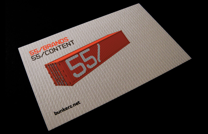
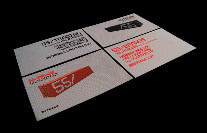
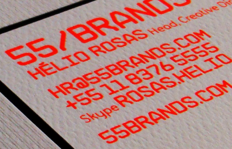
The container appears not only as a graphic application but as part of the identity's own concept. Just as a container organizes, protects, and transports different contents across borders, 55_Brands organized strategy, brands, ideas, and content for different business contexts. This relationship allowed the creation of a modular, flexible, and international visual system in which different colors identified pillars and areas of the consultancy's expertise, transforming the identity into a tool for organizing the firm's own offerings. White, black, neutral tones, and an intense industrial orange formed a chromatic universe of strong contrast, creating immediate recognition without compromising the brand's sobriety. The system expanded naturally across containers, presentations, business cards, institutional materials, and communication, maintaining the same visual logic across different scales and media.
More than two decades later, the project remains visually contemporary. Created in 2004, the 55_Brands identity anticipates principles that would become even more relevant in contemporary branding: simple logos, modular systems, reduced visual codes, responsive identities, and brands capable of existing as language rather than mere symbol. For SB\Design, this project represents a vision of logo creation in which form and strategy are inseparable. Modernity does not come from following a graphic trend but from finding an idea clear enough to continue making sense over time. The result is an industrial, minimalist, international, and systematic identity — created for a strategist who works precisely at organizing complexity and transforming thought into value.