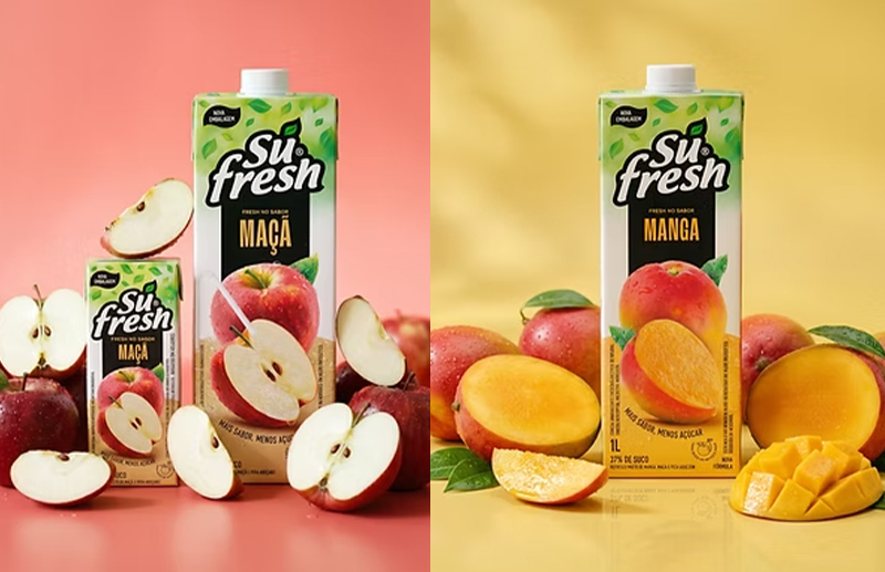
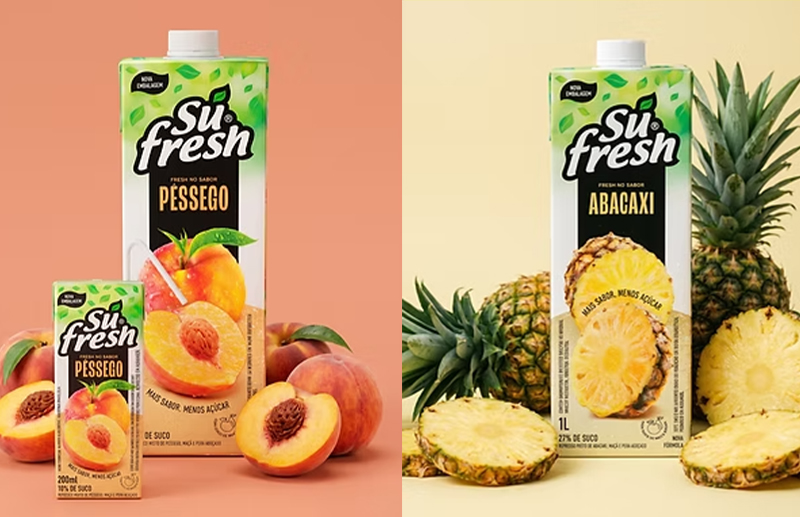
The Brazilian beverage market is one of the most competitive in the world. On supermarket shelves, hundreds of products compete for consumer attention in seconds, making packaging design one of the main factors for differentiation and purchase decision. It was in this scenario that the SuFresh line redesign project was born, developed by SB\Design under the creative direction of Sandro Bianco, in partnership with 55_Brands, responsible for brand strategy and client relations. The challenge was far greater than simply updating the packaging appearance. It was necessary to visually rebuild a complete product family, strengthening brand perception, improving shelf presence, and creating a consistent graphic system for the entire line.
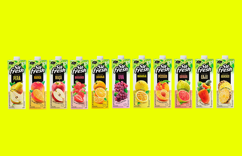
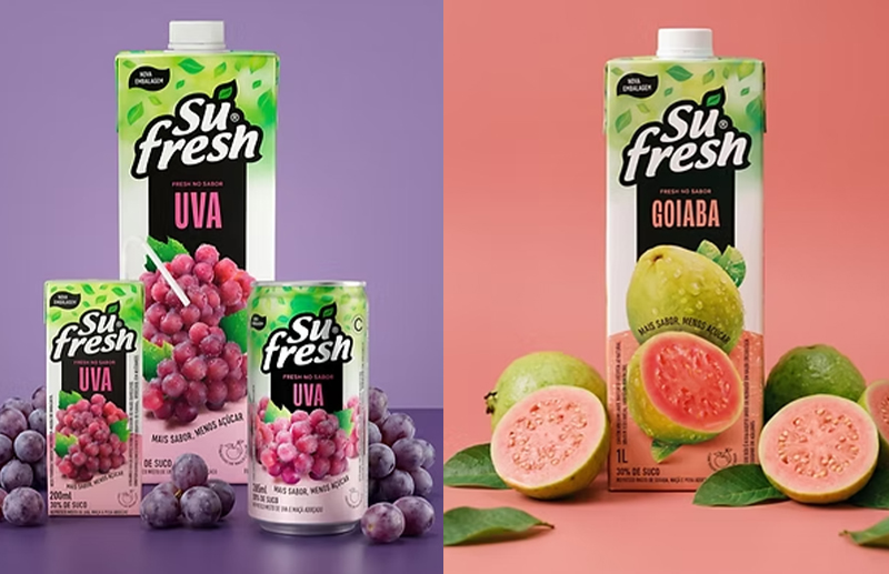
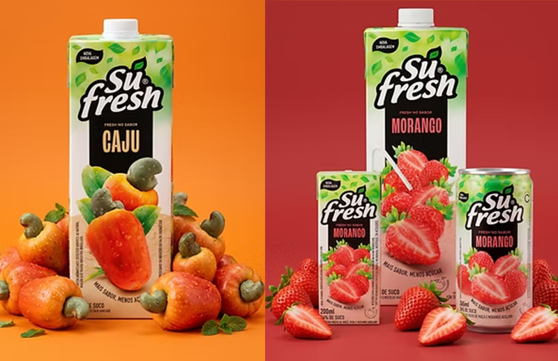
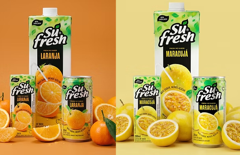
The project involved extremely detailed packaging architecture work. In total, over 30 applications were developed, distributed across 11 one-liter Tetra Pak packages, 11 200ml boxes, and 11 cans, each with completely different physical characteristics. Although the consumer sees only a uniform identity on the shelf, behind this result lies nearly surgical adaptation work. Each format has specific proportions, printing areas, curves, safety margins, and hierarchies. The major challenge was ensuring that logo, photography, nutritional information, flavor denomination, commercial callouts, and graphic elements occupied equivalent positions across all formats, preserving visual unity without compromising legibility or commercial efficiency of each package.
This consistency was built packaging by packaging. No solution was simply replicated. Each of the 11 flavors underwent an individual visual refinement process. The fruits were produced and photographed separately, digitally treated, and positioned according to their volume, scale, and readability on the package. Lighting, texture, shine, cutouts, shadows, and composition were carefully adjusted to convey freshness and naturalness while reinforcing the product's commercial appeal. The result is a visual system where each flavor has its own personality, yet remains immediately recognizable as part of the SuFresh family.
Projects of this nature require far more than aesthetic mastery. They depend on deep knowledge of graphic production, flexographic and offset printing, industrial limitations, material behavior, brand perception in retail, and consumer behavior at the shelf. It is precisely in this type of challenge that SB\Design has consolidated its work over more than three decades. Under the creative direction of Sandro Bianco, various packaging projects have been developed for national and international brands, always seeking to balance branding, commercial strategy, industrial efficiency, and visual impact. The SuFresh line redesign demonstrates this capacity to transform complex systems into simple, consistent, and highly competitive point-of-sale solutions.
More than a redesign, this project represents the construction of true packaging architecture. Every decision was made considering the behavior of the complete line, not just a single product. The consumer may never perceive the number of hours invested in aligning dozens of graphic elements across different formats, but it is precisely this rigor that makes a brand appear solid, organized, and trustworthy when it reaches the shelves. This attention to detail is one of the characteristics that define SB\Design's work and Sandro Bianco's practice, reinforcing their specialization in creating packaging systems for brands that need to compete in large-scale markets.