
0%
2011 :: AM
agency: HLD
client: AM Beverage
job: packaging design
intro: Healthy habits make our body work better, right? But all we have today is not enough to make our life 100% healthy. After all, most products we eat don\’t come from reliable sources. How about supplements and vitamins? They are even worse, since they are also synthesized and they can’t add balance to our body.
So, instead of talking about supplement, how about complement? Replacing substances to our body – substances which food can\’t provide us with. But where are those substances? Answer: Amazon Forest - where biodiversity and its millions of animal and plant species reign. This is a universe able to produce aromas, flavors and active compounds, impossible to be synthesized in any laboratory.
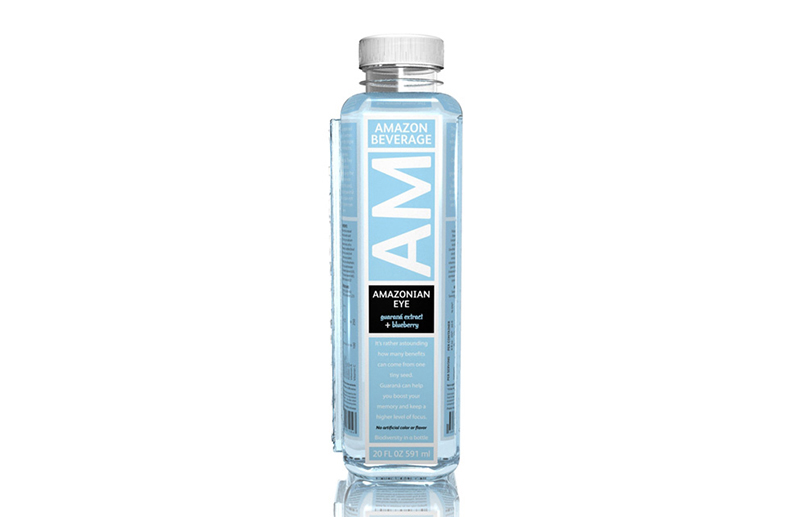
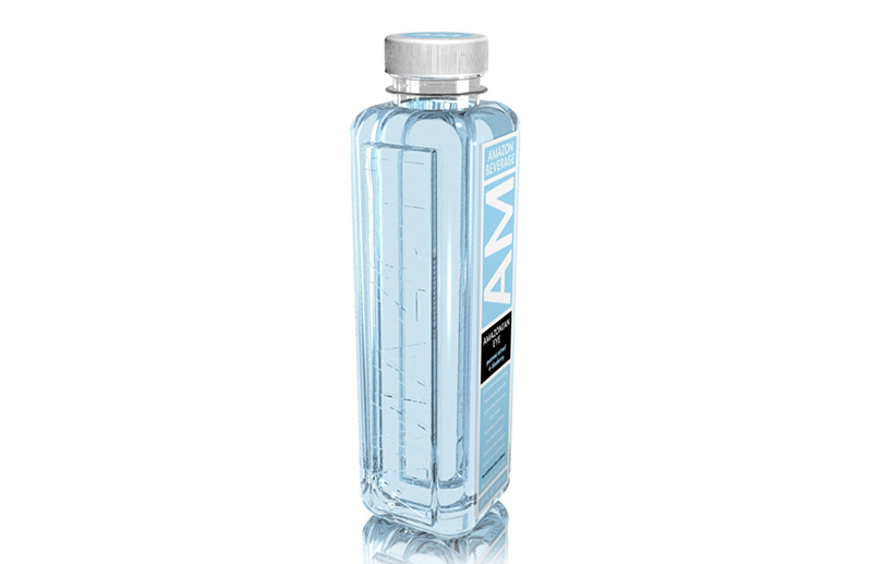
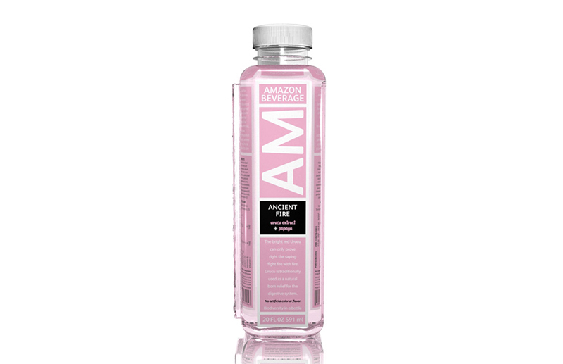
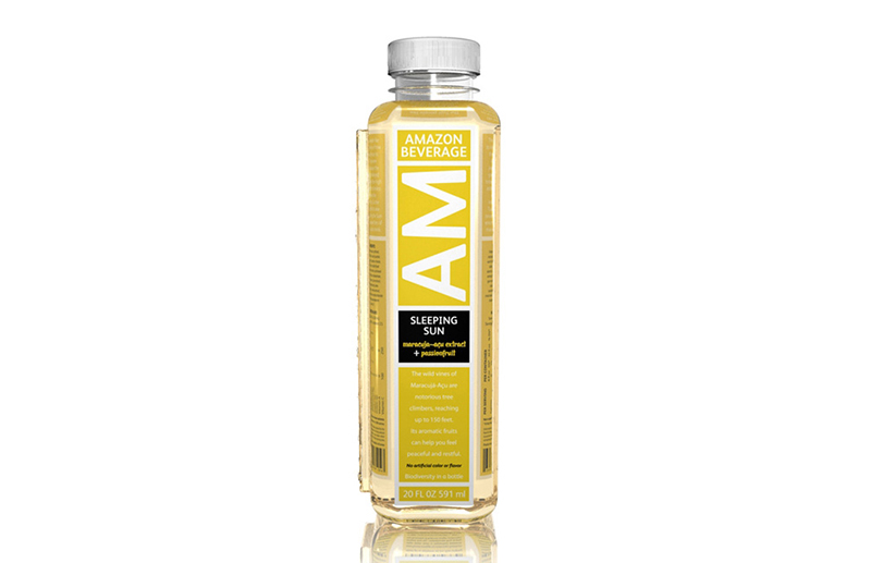
Following this line of thought, a brand naming job was carried out and the name was chosen: AM Water. Well, we had already got a discourse, a context and a name but we hadn\’t got a shape. Afterwards, we started the contour development process. The idea was creating a relevant and minimalist bottle, and its image would be inspired by medicine packaging.
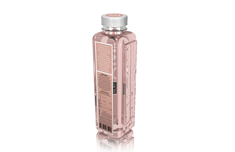
Problem: the cylindrical shapes used for most medicine bottles make the label instruction to be curved, making its reading difficult. Well, what we immediately need to identify when we look at a medicine bottle are 3 elementary pieces of information: name, indication and dosage. The challenge was to correct the mentioned points without losing the minimalism, always present in medicine and supplements.
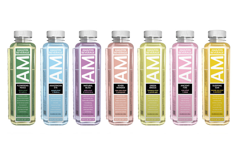
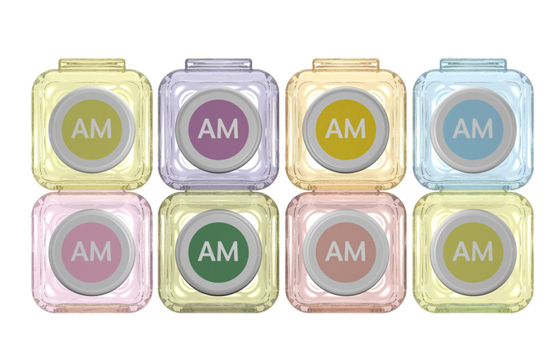
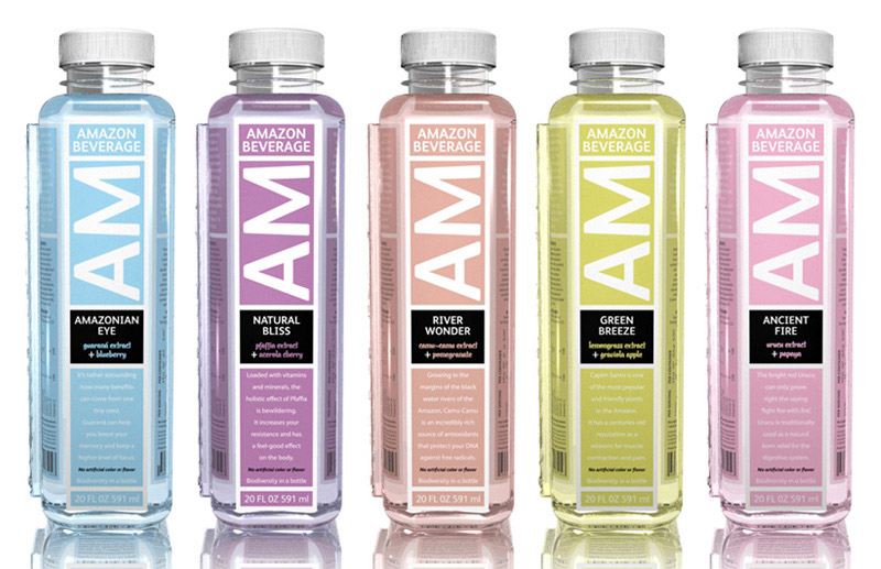
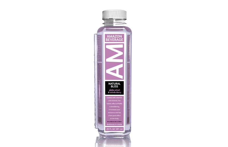
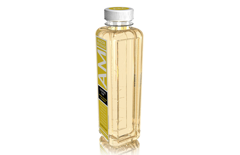
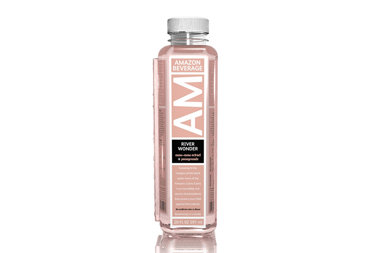
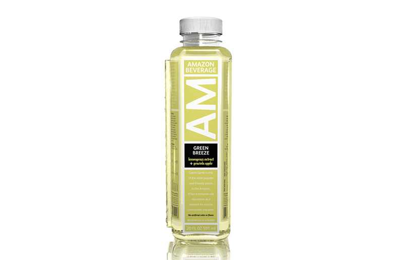
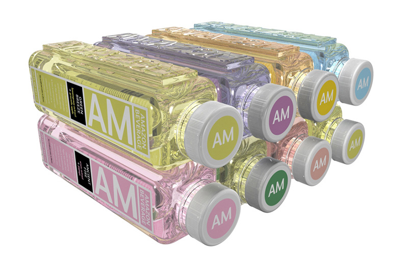
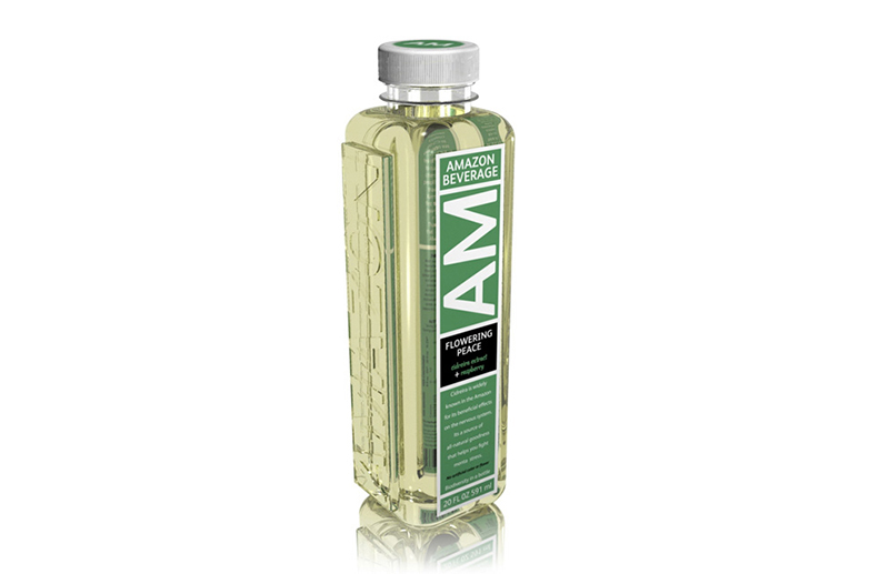
The first thing to do was sorting every piece of information out and make it easy to be understood. Secondly, we had to draw an entirely flat shape so that everyone could understand labels at a glance. In this case, the main name was applied on a bottle in vertical position; several side effects information cards were developed, as well. Finally, the two most important solutions: the introduction of a color identification system to differentiate each product and line, and the creation of a plug in the body of the bottle to make its transport safer and increase its storage capacity, perfectly designed for hot liquid filling.
36 contour options were drawn and showed. 5 of them were pre-selected, restudied and redesigned. 2 were chosen for mock-ups, 3Ds print and structure tests development. Simultaneously, other 48 label options for the 2 chosen lines were developed, what resulted in a line with seven different flavors.
The flavor was developed by www.wildflavors.com, and the packaging was developed by Graham Packaging Company.
As a result, now we have developed a very useful item, besides all benefits for people\’s health.