
0%
2011 :: GOOD
agency: HLD
client: GOOD Magazine
job: Redesign the Food Label
intro: This is my submission to GOOD and News21\′s competition to redesign and modernize the food label.
Description project:
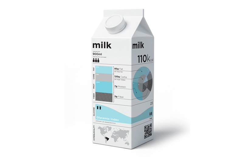
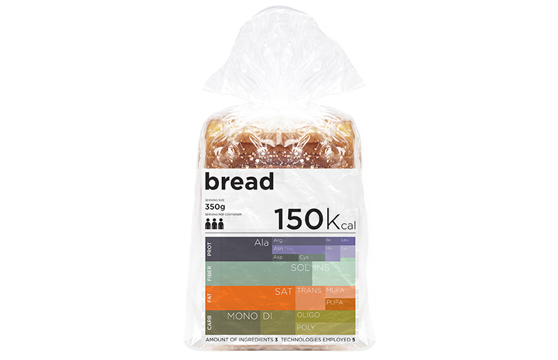
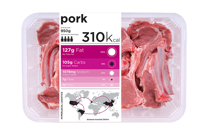
First on top there is a number for the calories per serving. The number of servings in the package is displayed by pictorial individuals through multiplication. This should develop a meaning that the whole content of the package is to be divided in portions. Two different graphics are right bellow, one squared with macronutrients and another circle from micronutrients, such as vitamins and minerals. Both representations amount to the total in weight of the calories per serving. with the respective grams and milligrams averaged from each portion. Every nutrient type is subdivide in its molecular weight fraction. In the middle there is another graph with the glycemic load in time.
It should be very useful to managing diabetes or even any primary energy intake interest, e.g. performance sports or weight restrictions.
A map is also used to represent all paths of any raw material or additive from origin to final consumption. The hyperlocal concept here favors local distributors with the visual advantage of zooming in to its proximity, a simple change for a state or a country map enables an easy recognition of this aspect.
On the bottom there is space left for certifications on any particular relevance, such as carbon footprint, social justice or others.
Collaboration:
Sandro Bianco + Fabius Leineweber (chemical engineer and a former candidate in philosophy of biotechnology. He currently develops ideas on health and technology issues.)